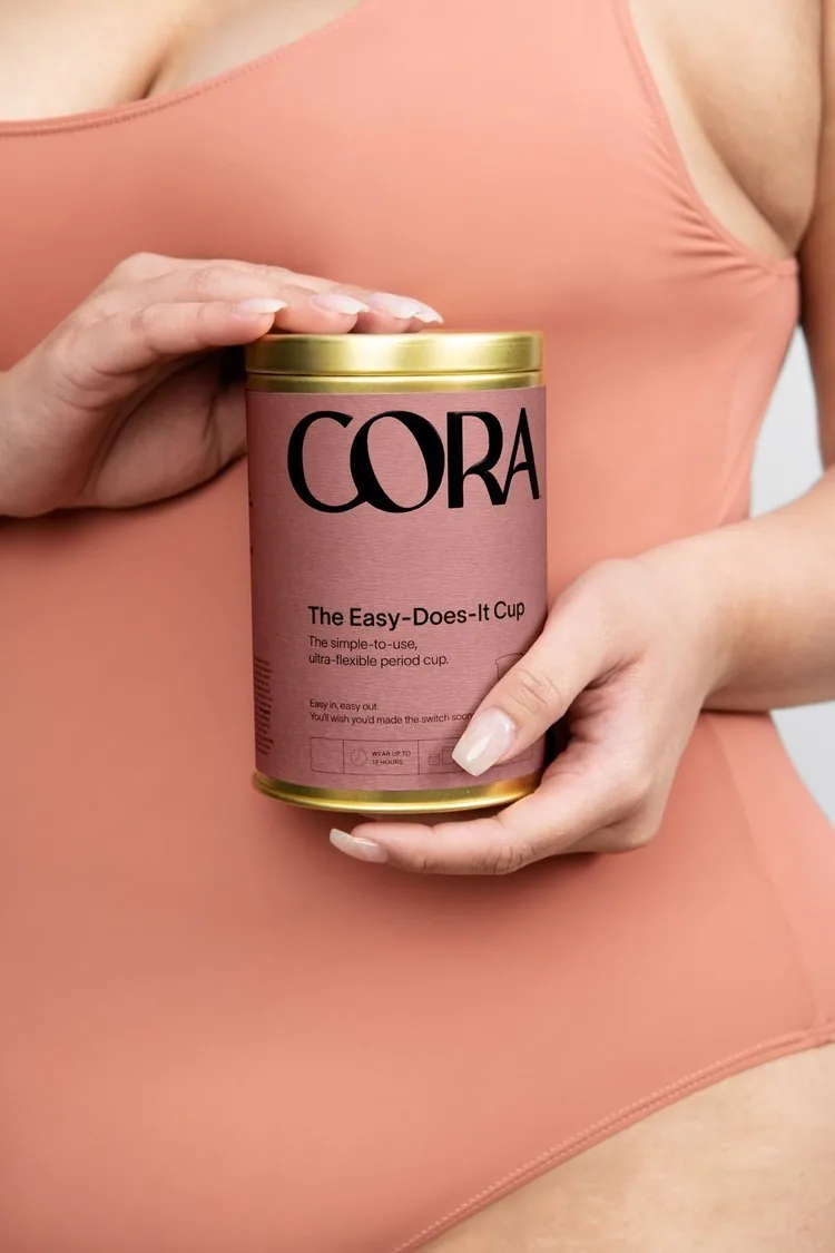
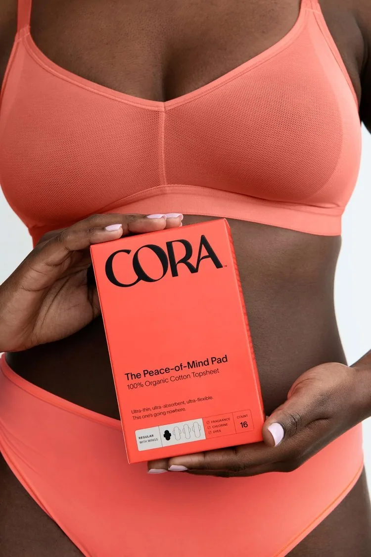
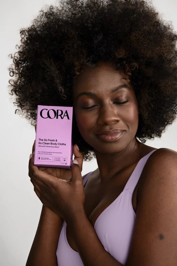
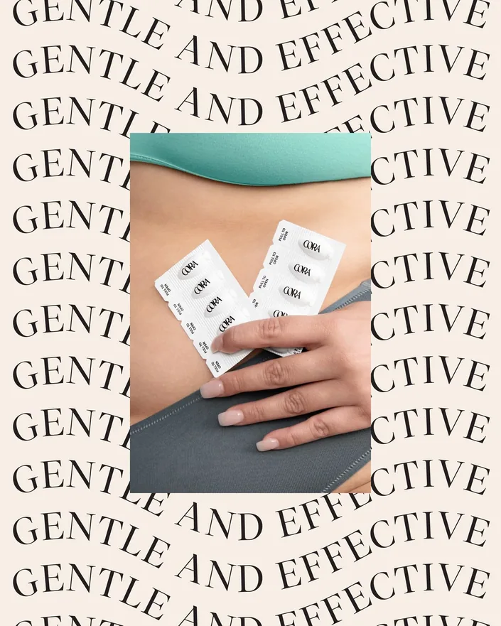
Cora helped define natural period care, and its look and voice set the tone for the whole category. With copycats close behind, the job was to stay a step ahead: standing out on shelf, staying relevant to millennial and Gen Z customers, and launching new products at pace.
/ the insight
Shift the conversation from clinical and shame-driven to relatable, personal and rooted in comfort.
In AIGA Eye on Design’s words: “Gen Z candor and millennial polish.”
01
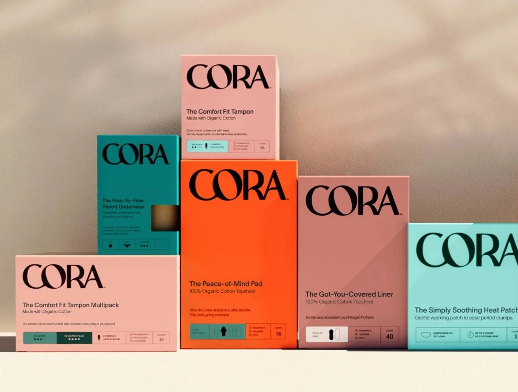
The rebrand, on 90+ SKUs
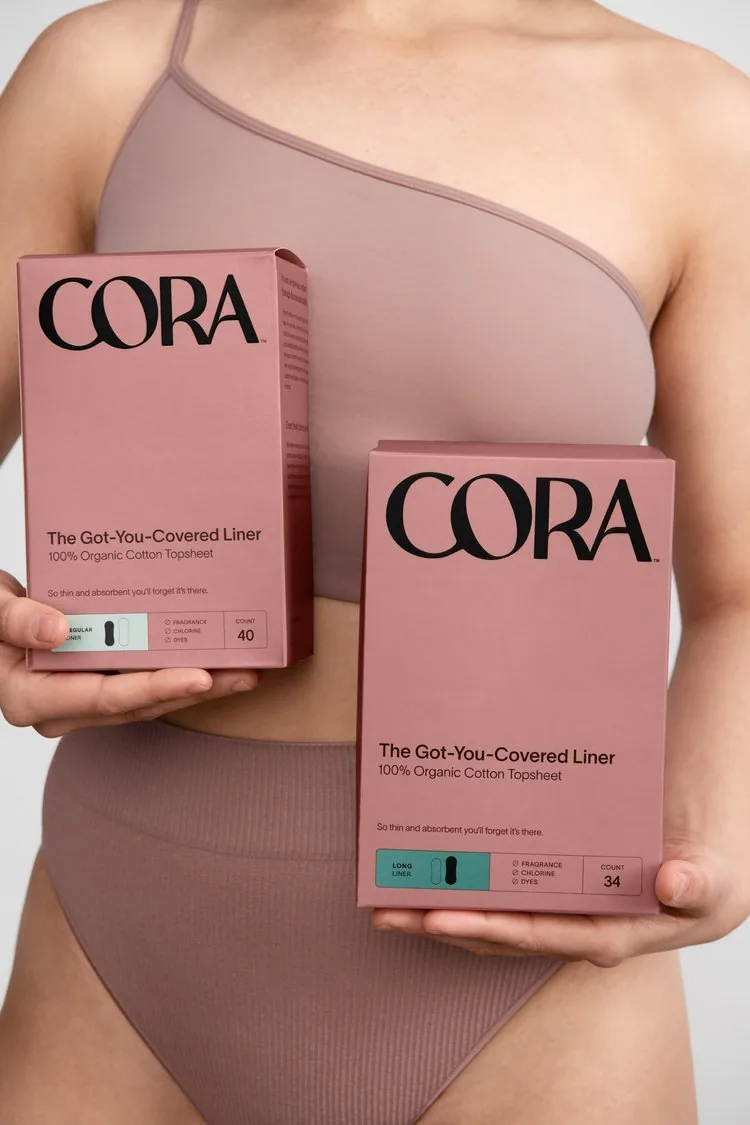
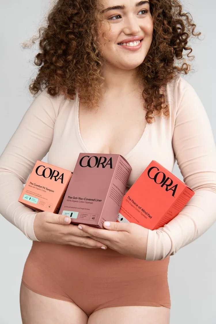
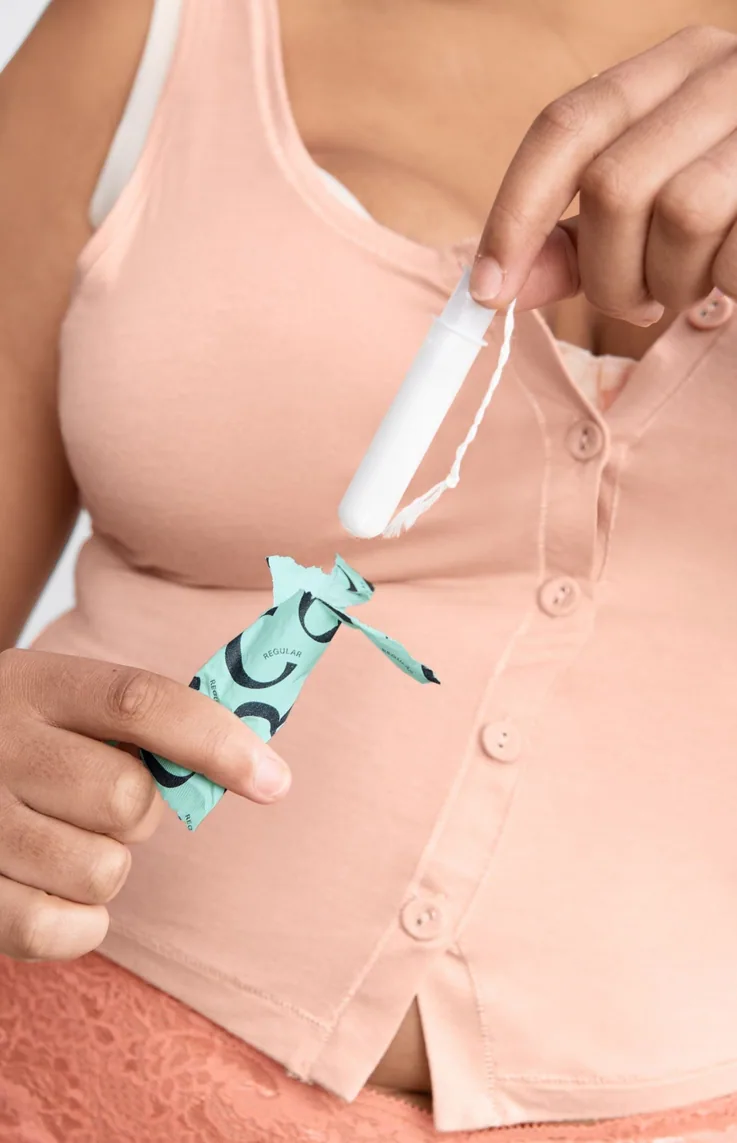
By 2022 Cora had outgrown its first look. With Mother London and Cora’s creative leads, we set the rules for the new packaging and carried them across the entire range with consistent, high-quality print.
02
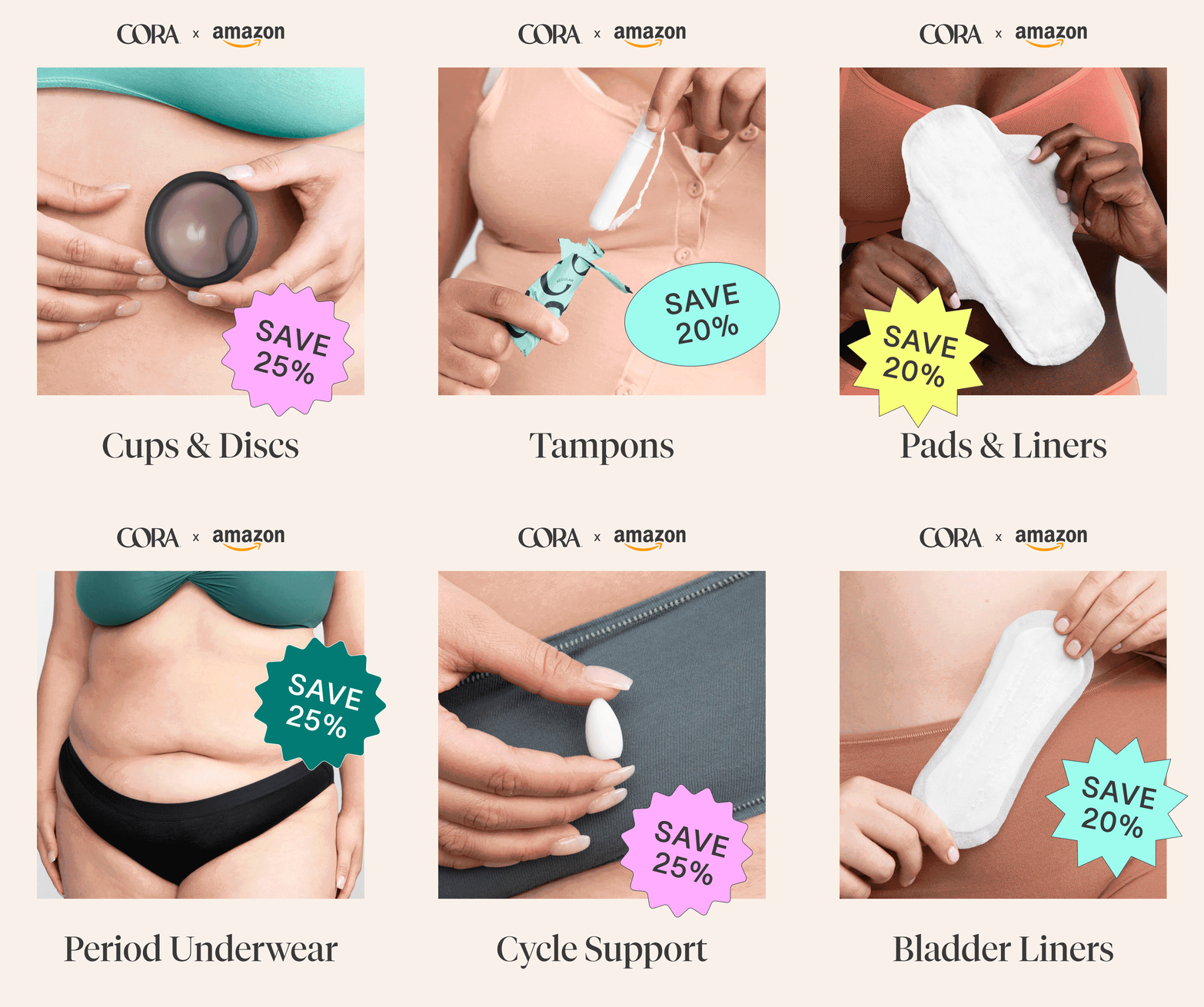
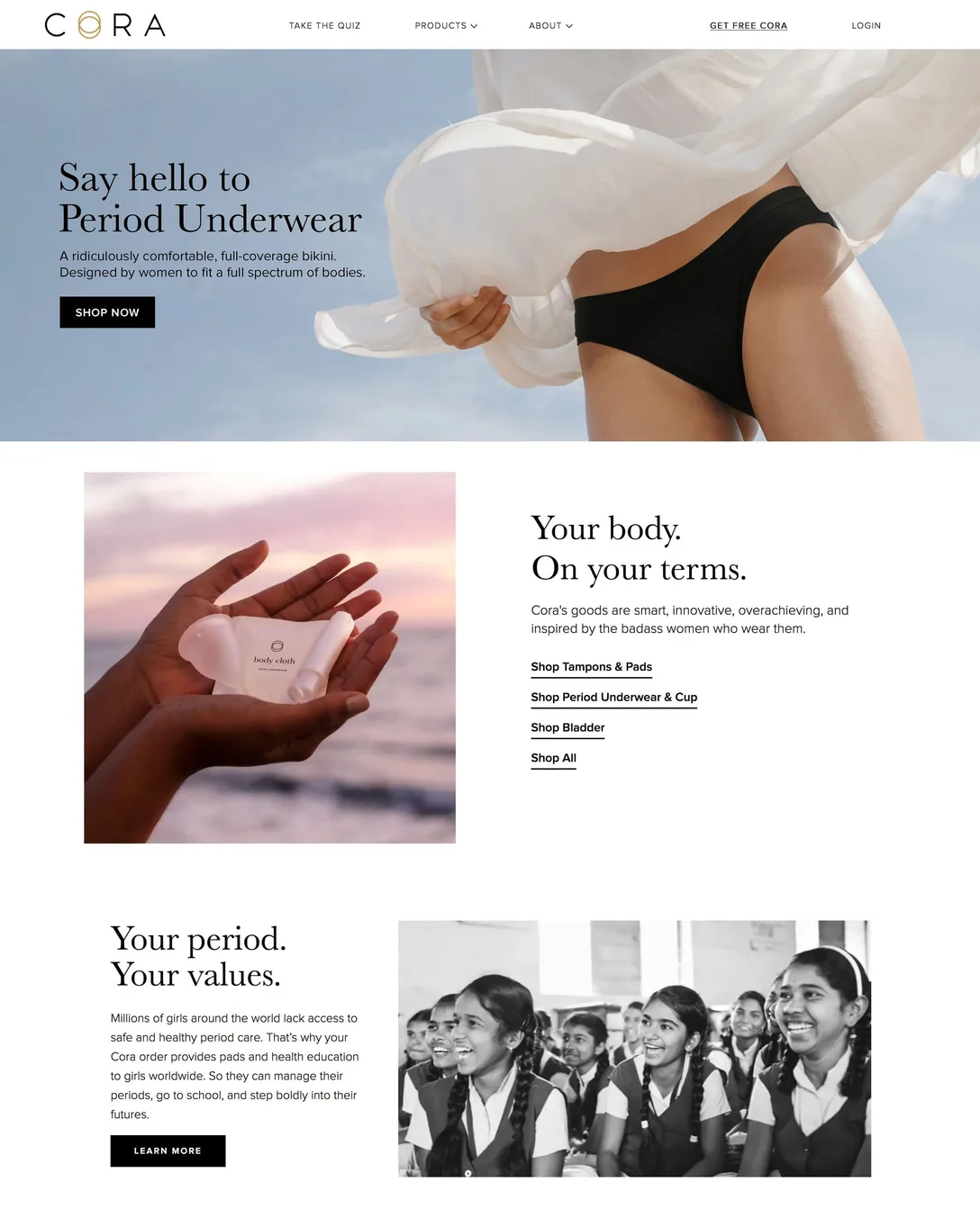
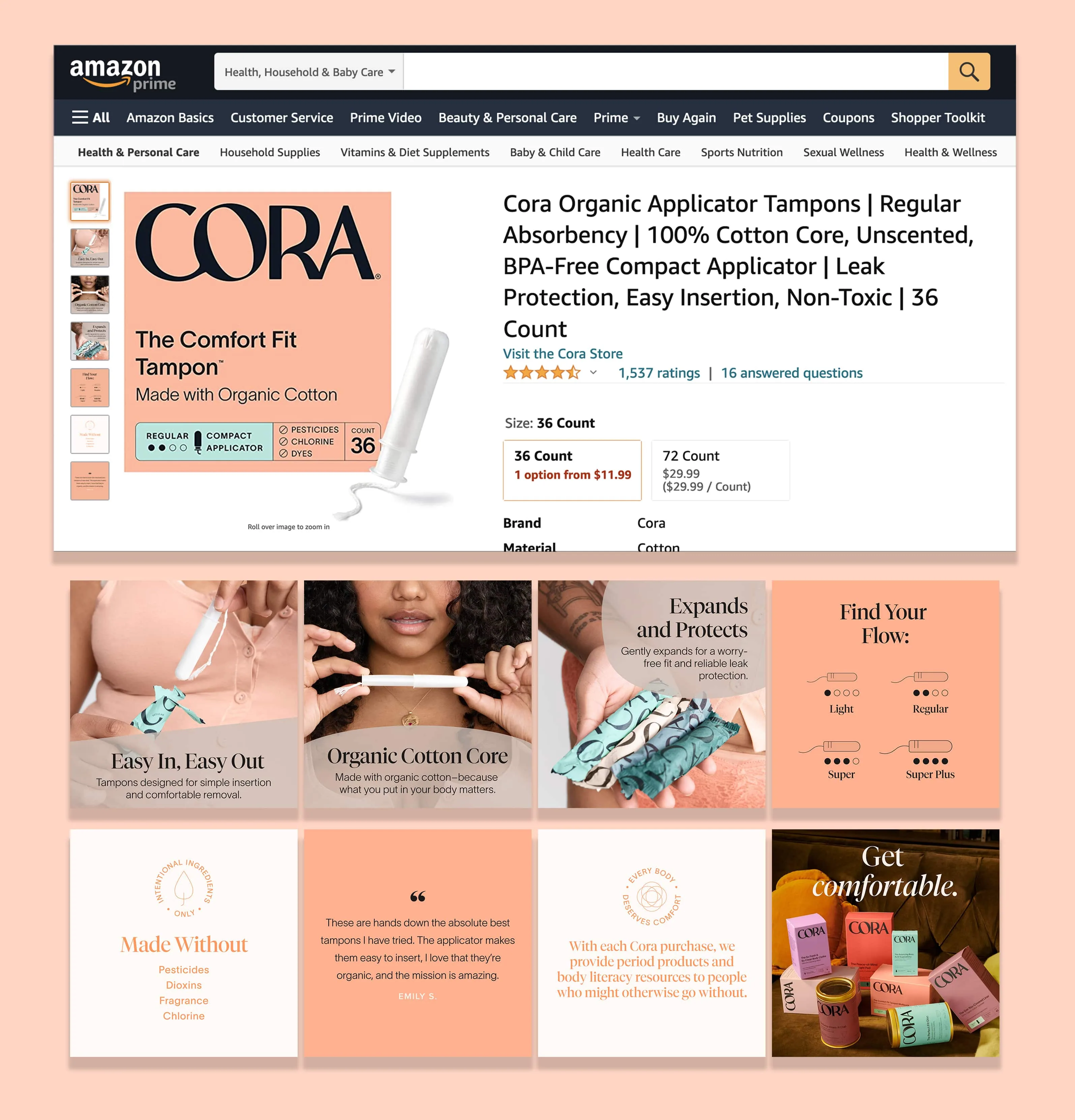
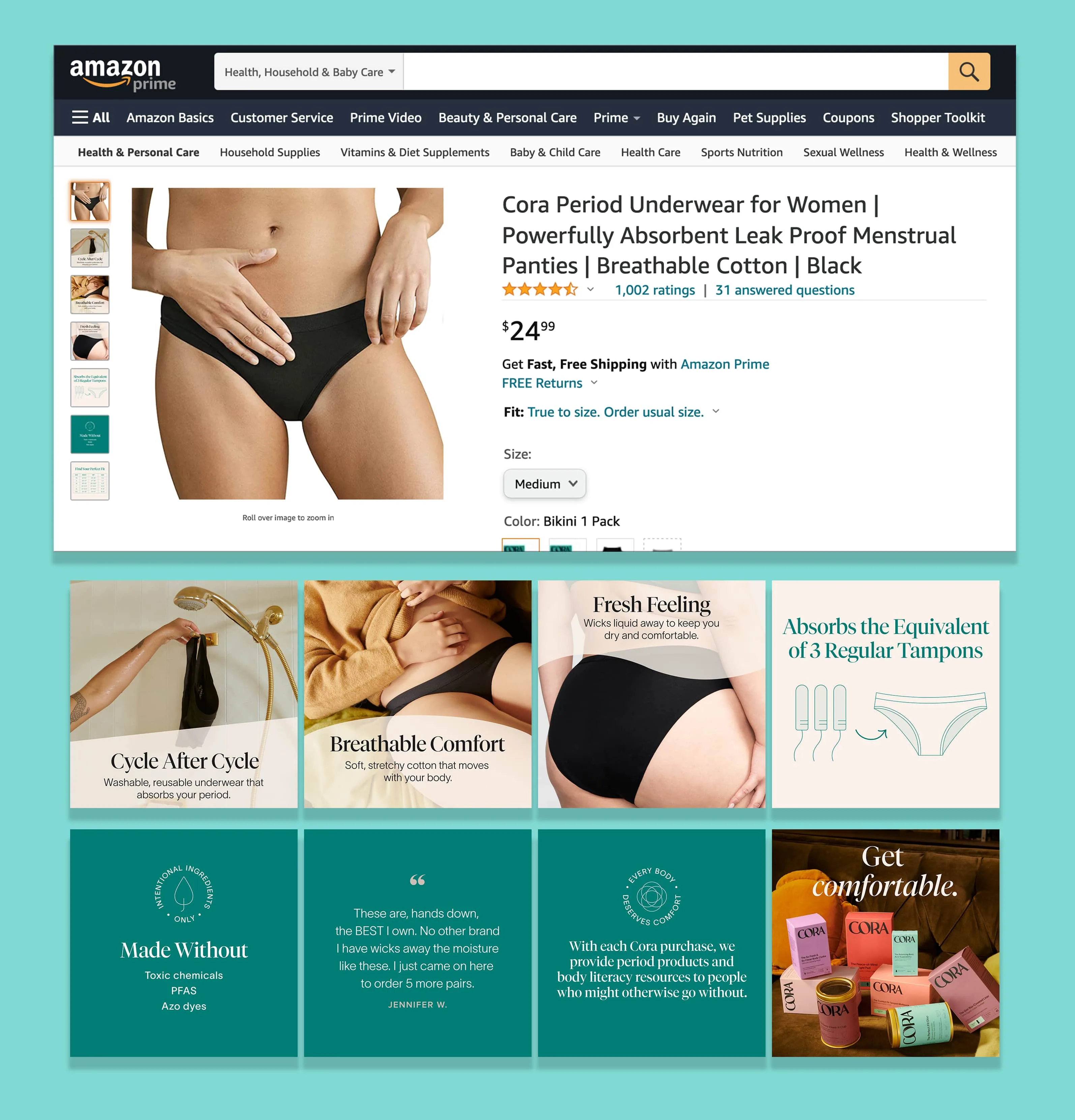
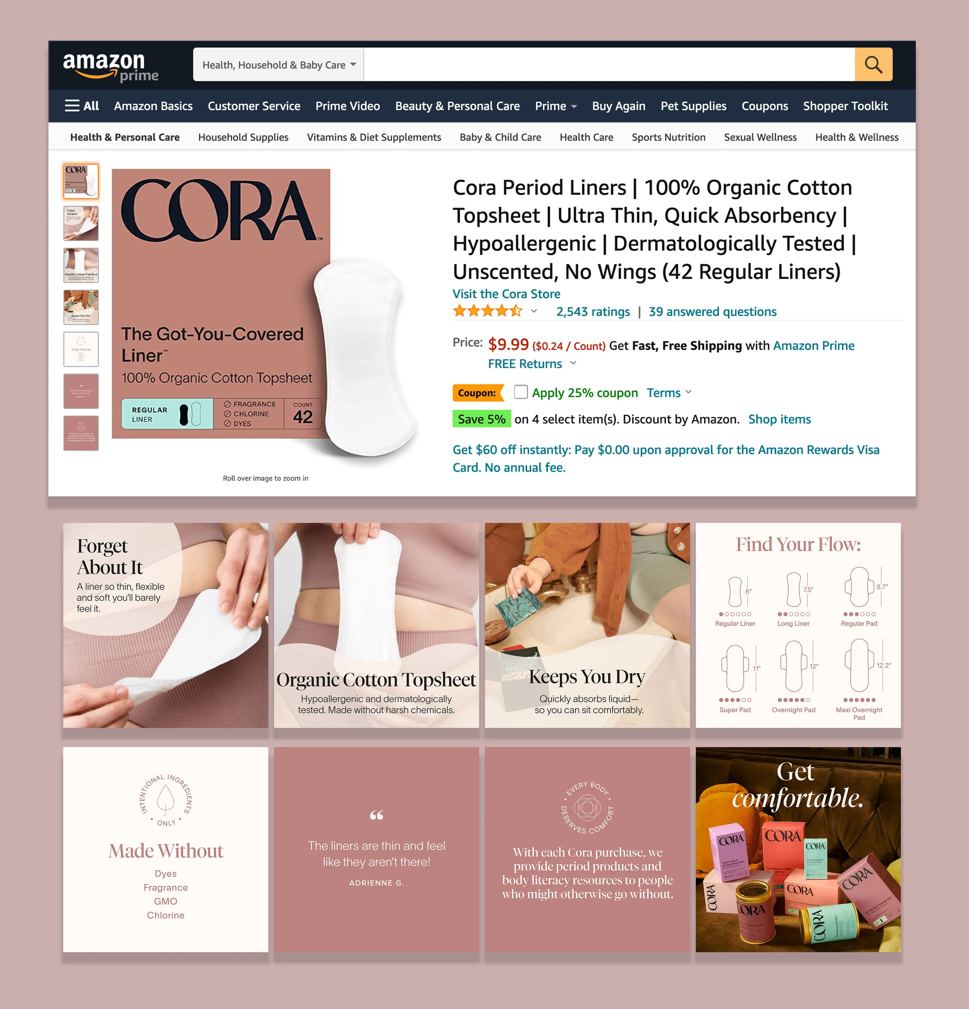
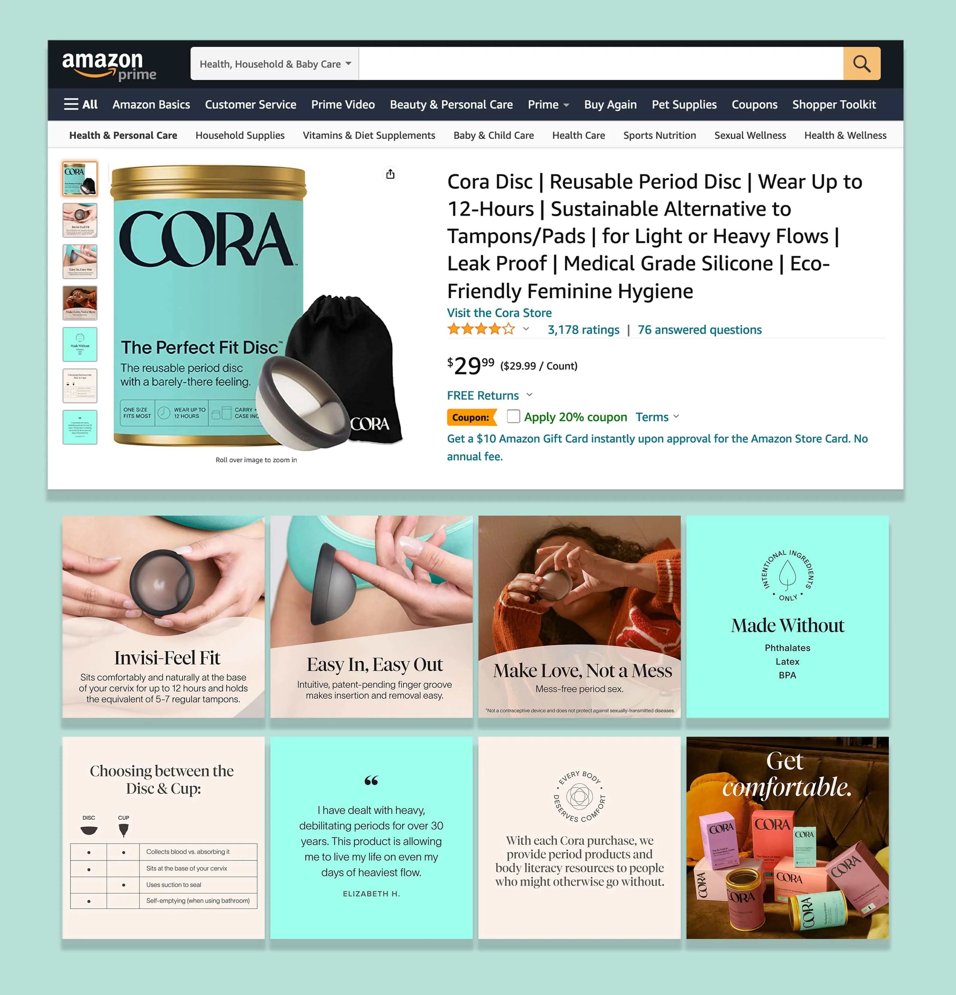
The Amazon storefront
Listings and a brand store for 21 SKUs, with A+ content that explains every product as warmly as the packaging does.
01 / 04
←
→
03
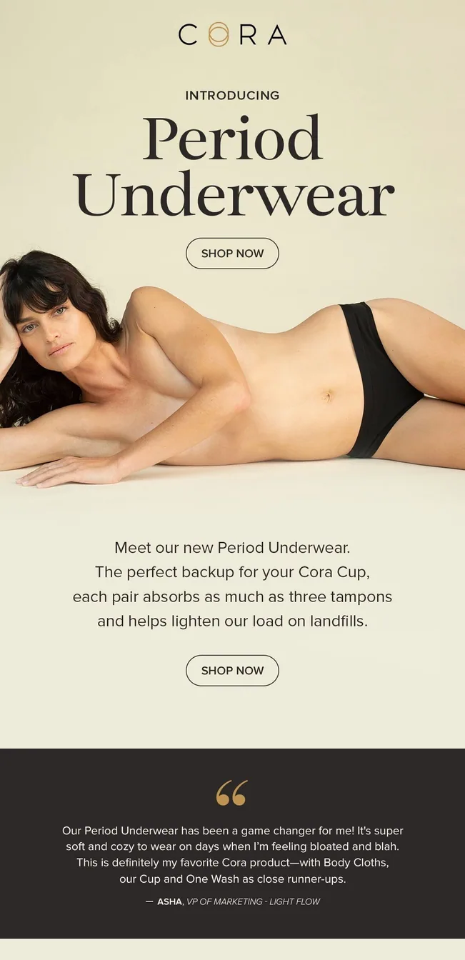
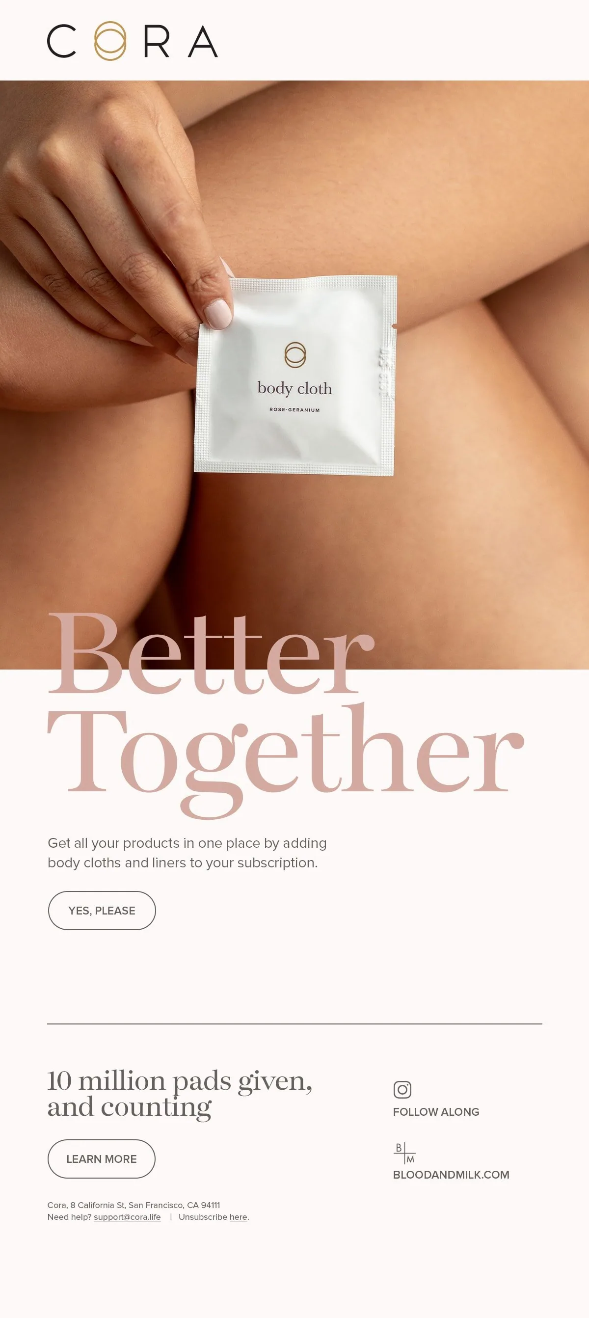
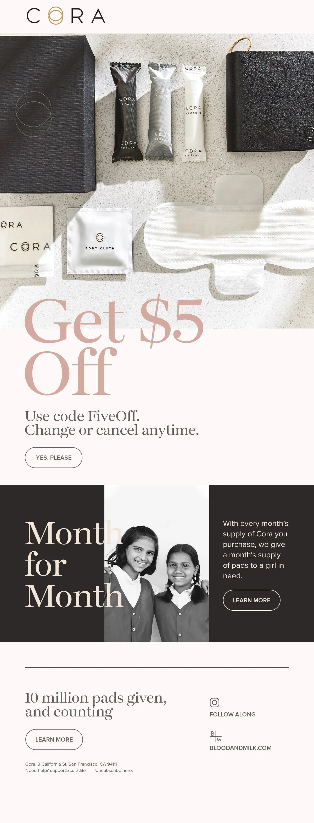
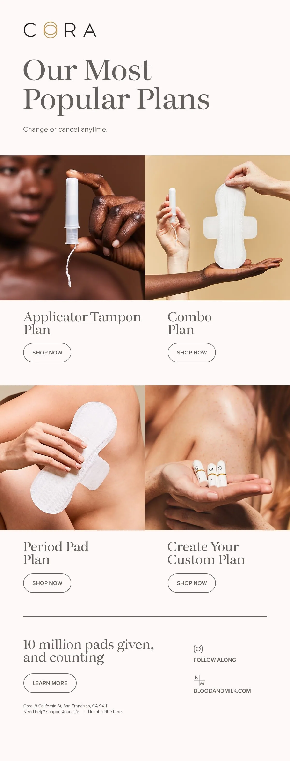
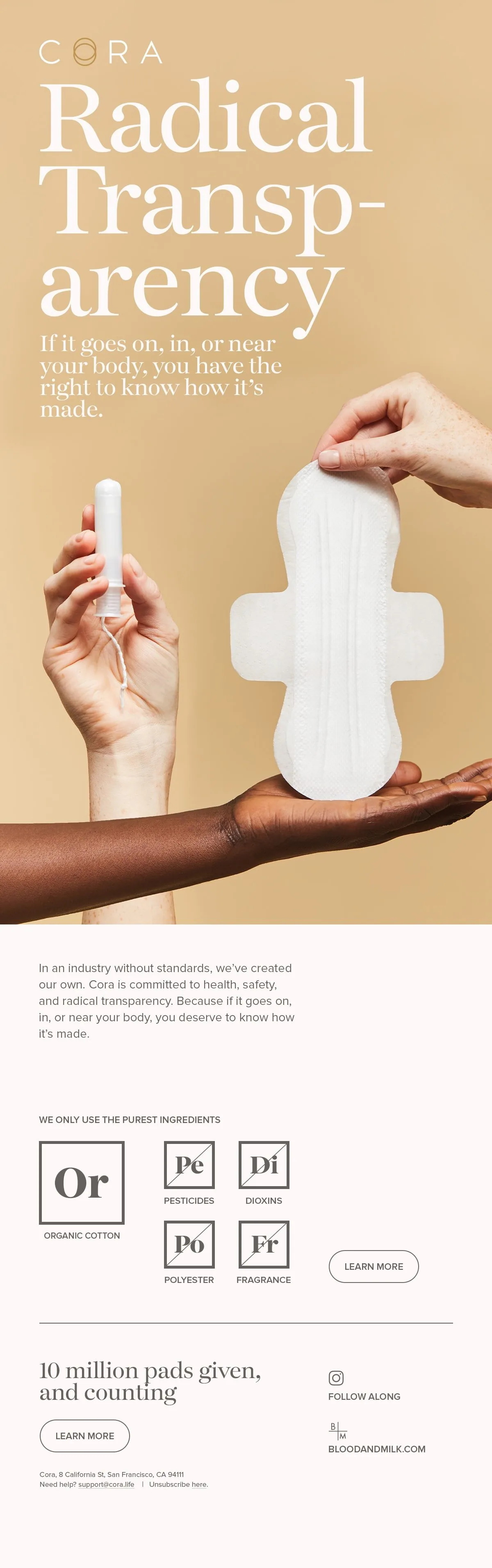
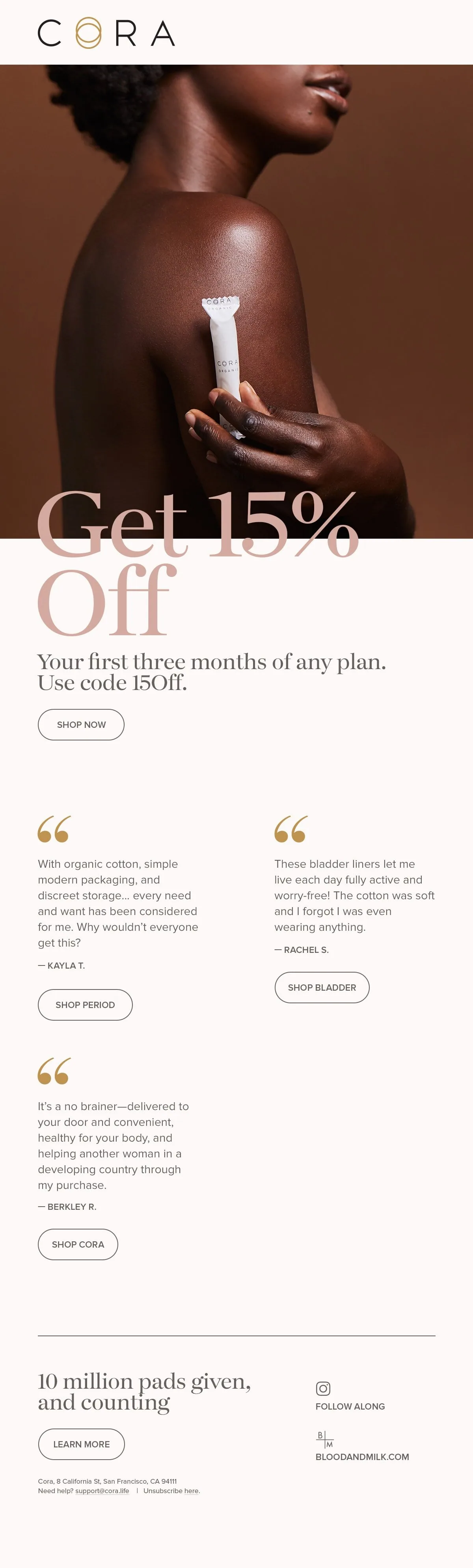
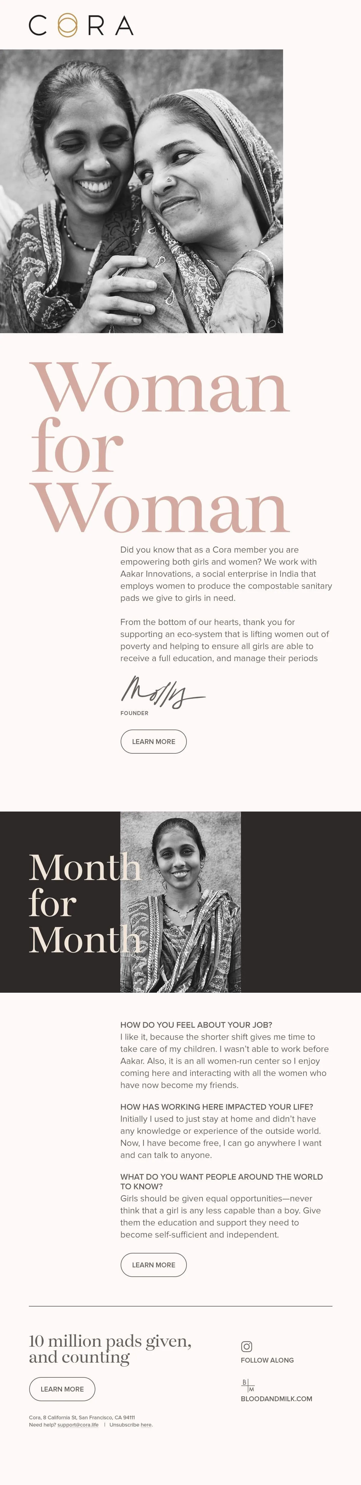
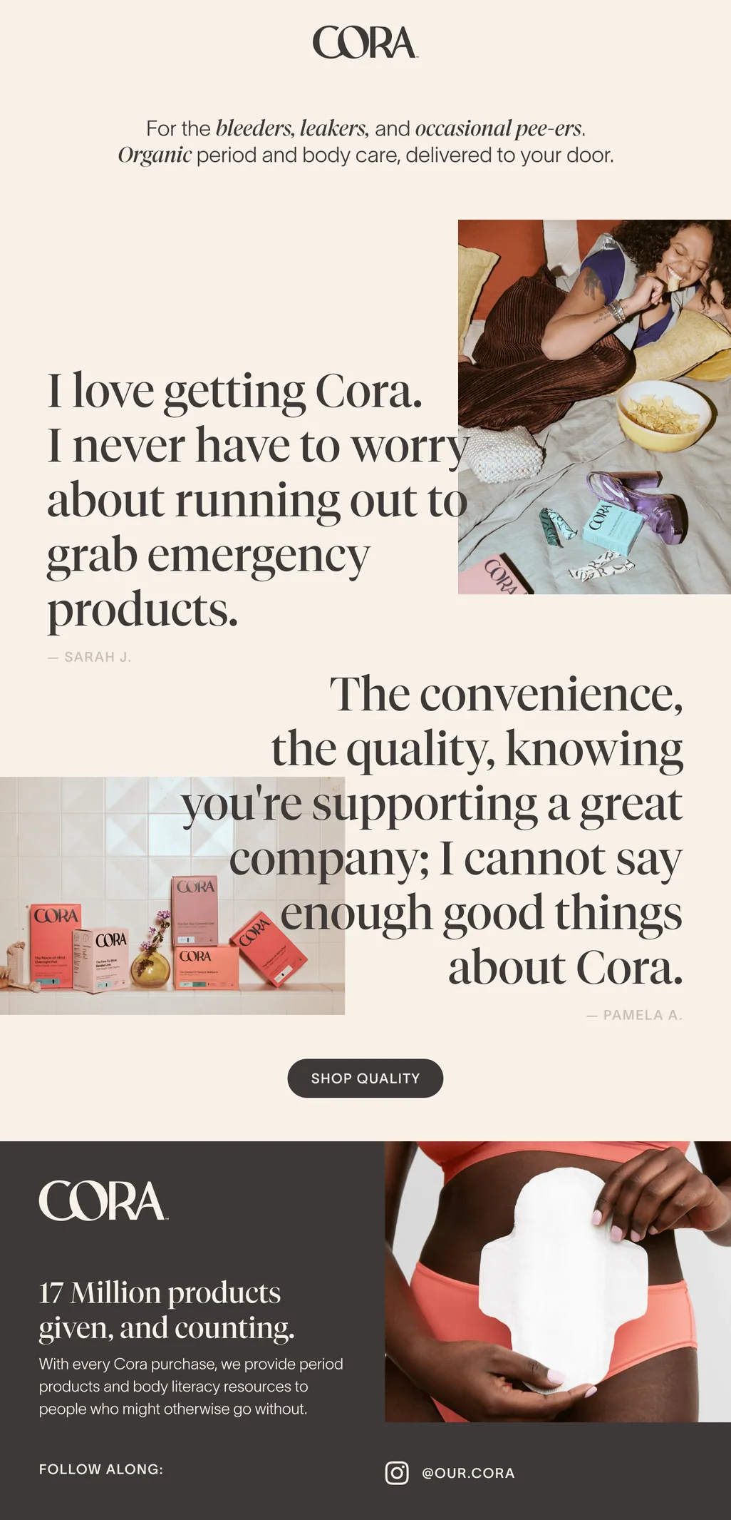
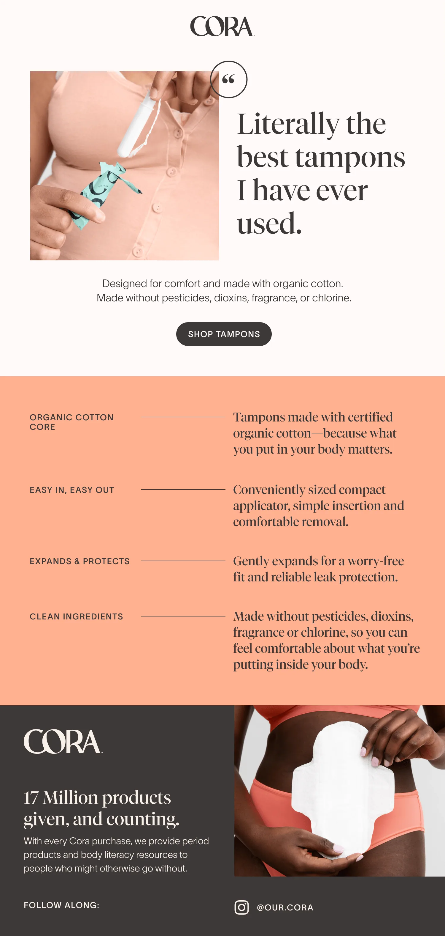
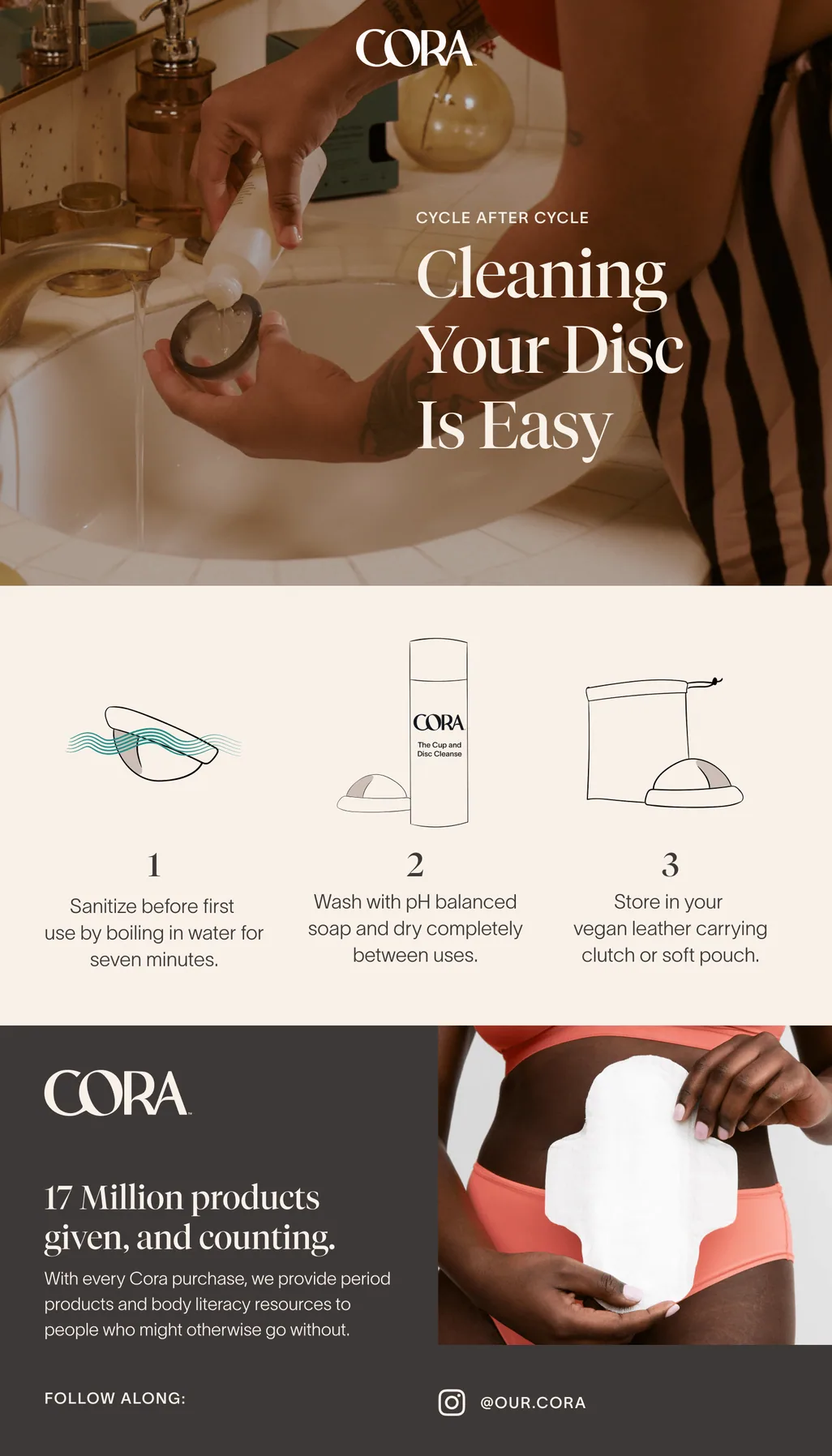
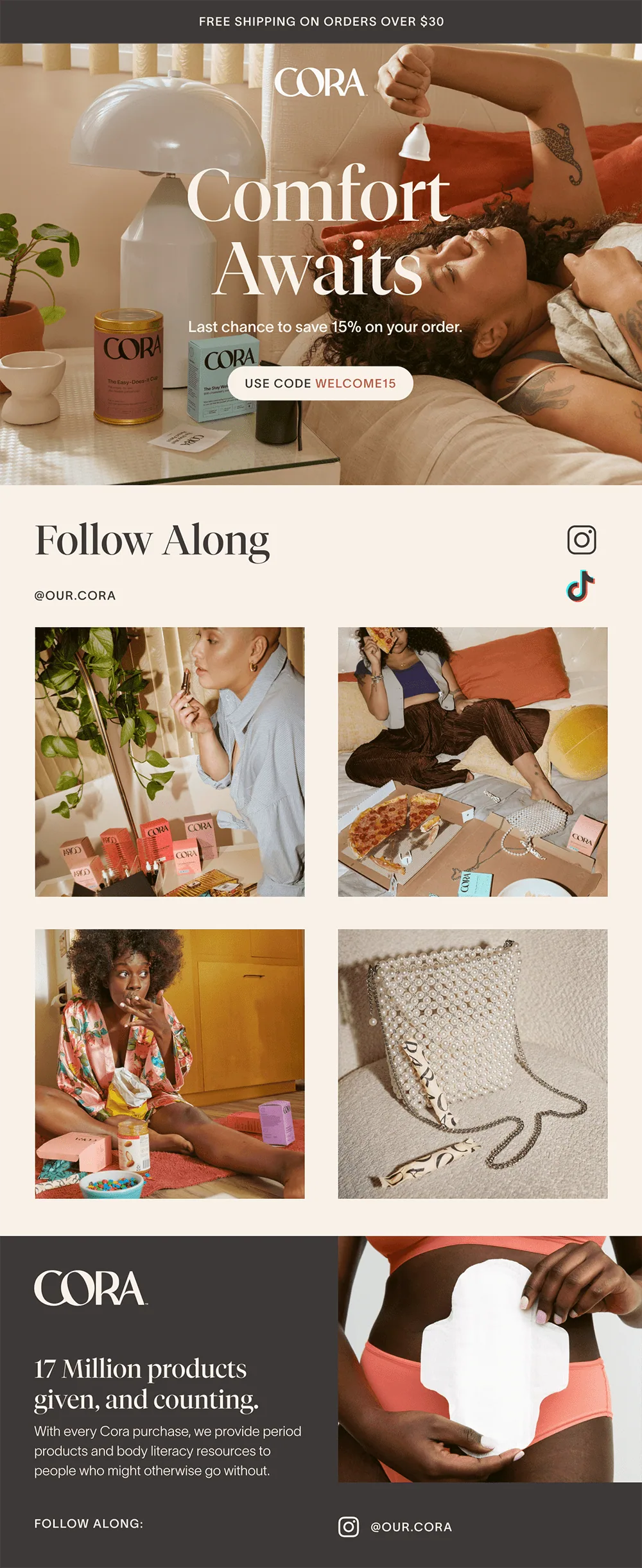
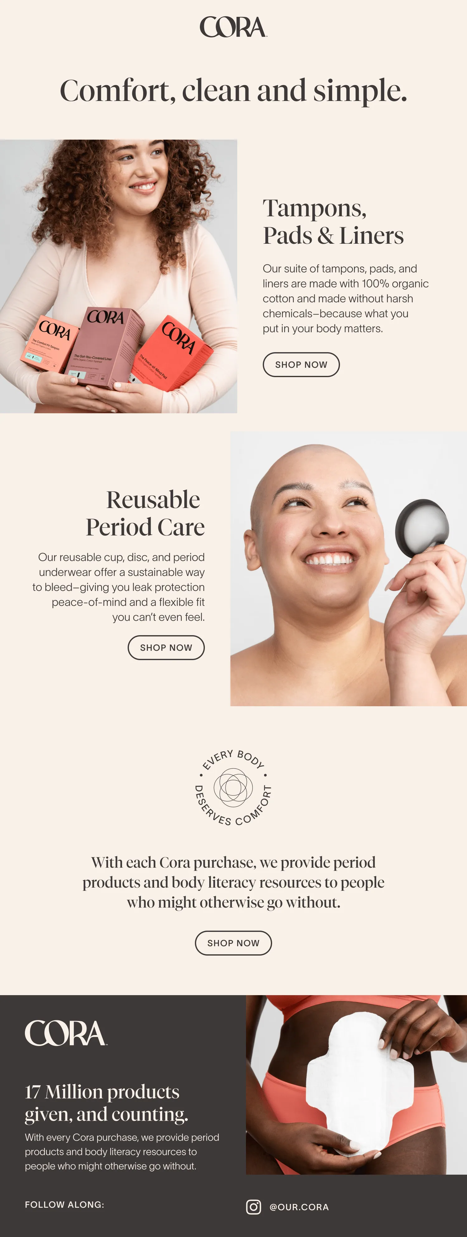
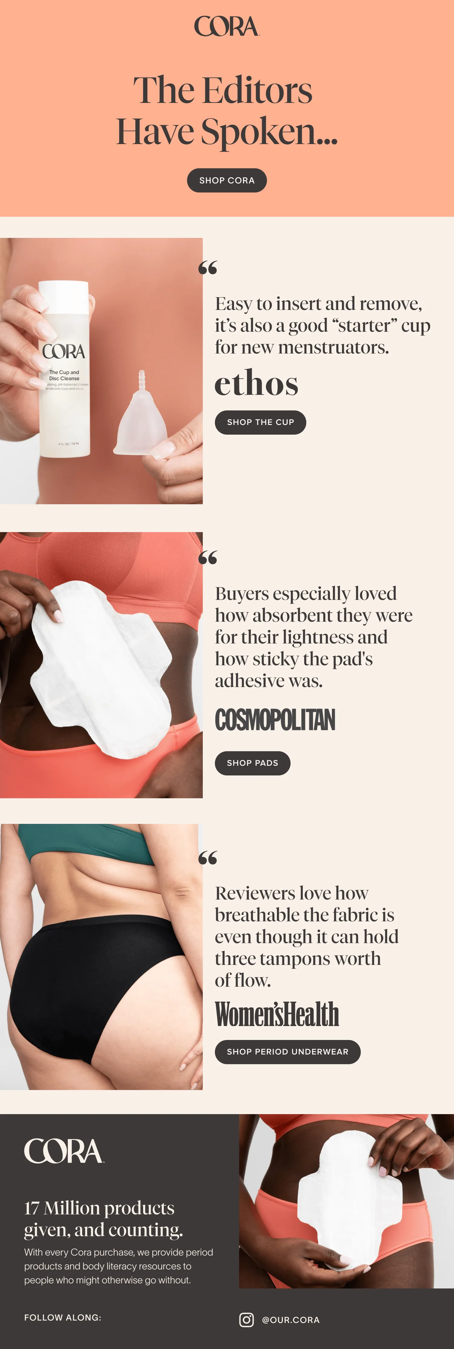
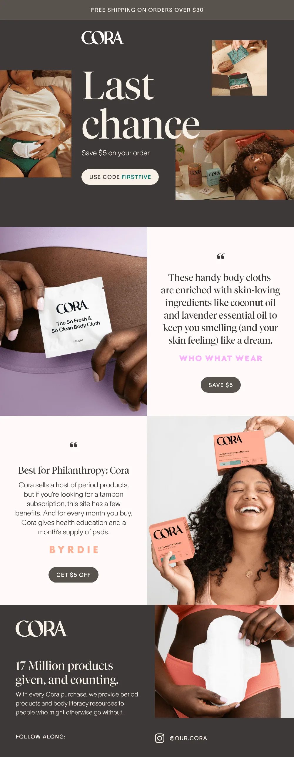
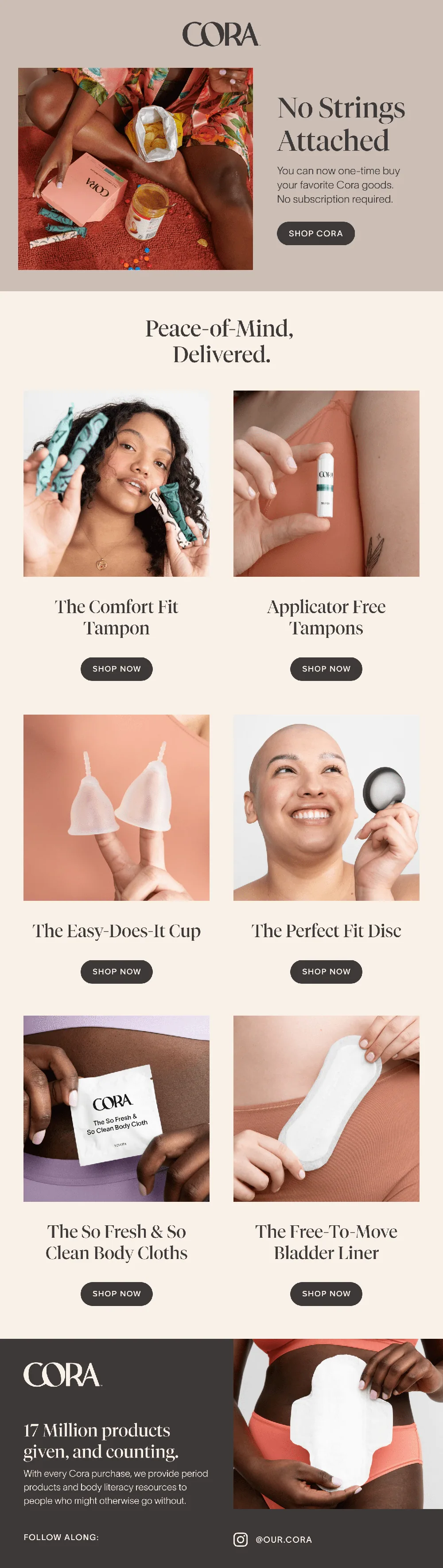
Email for every stage of the customer journey
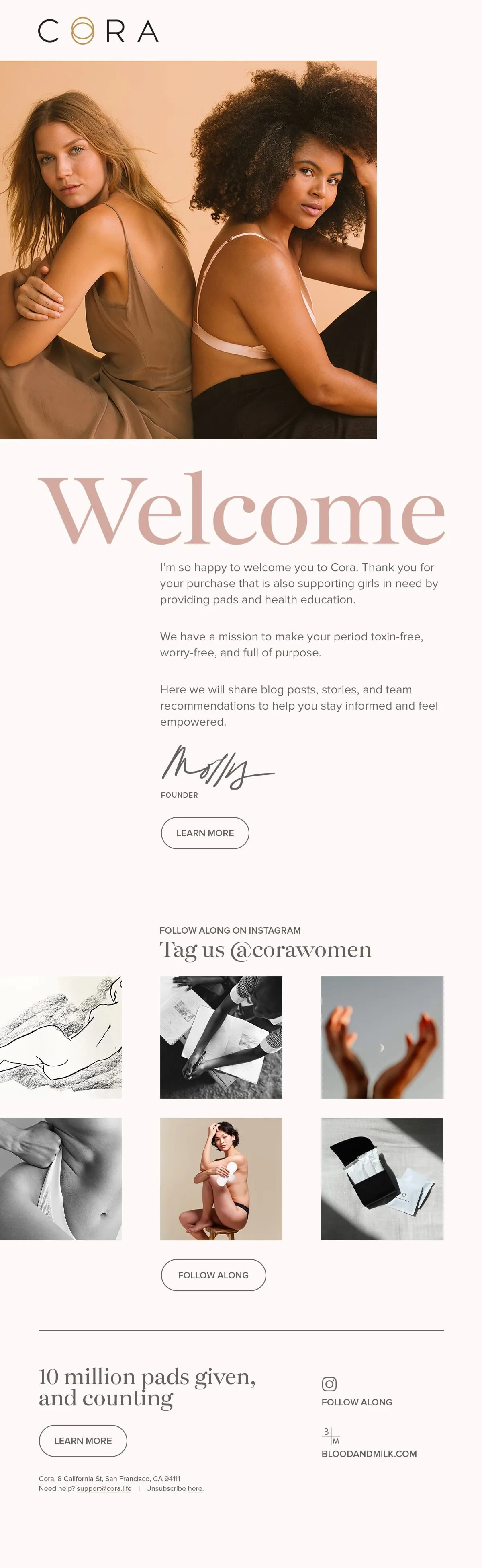
The new brand rolled out across welcome, education and promotional emails, built as a flexible system the marketing team could keep using.
01 / 10
←
→
04
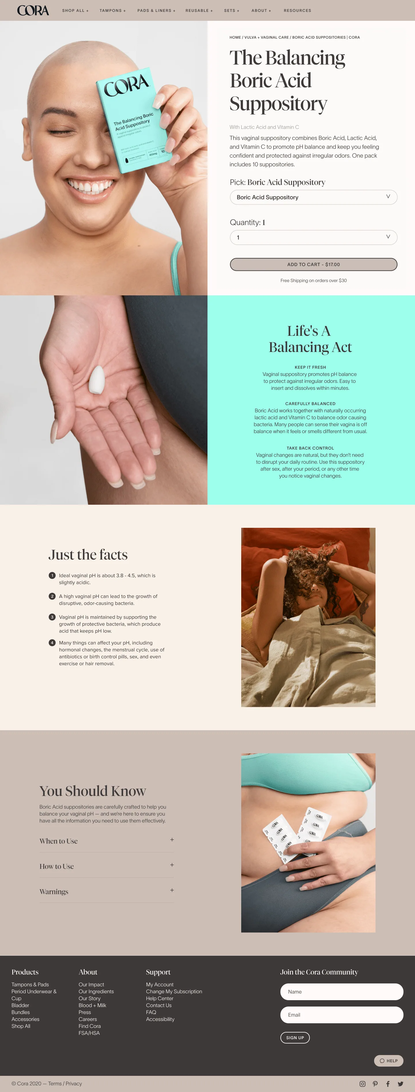
New product launch campaign
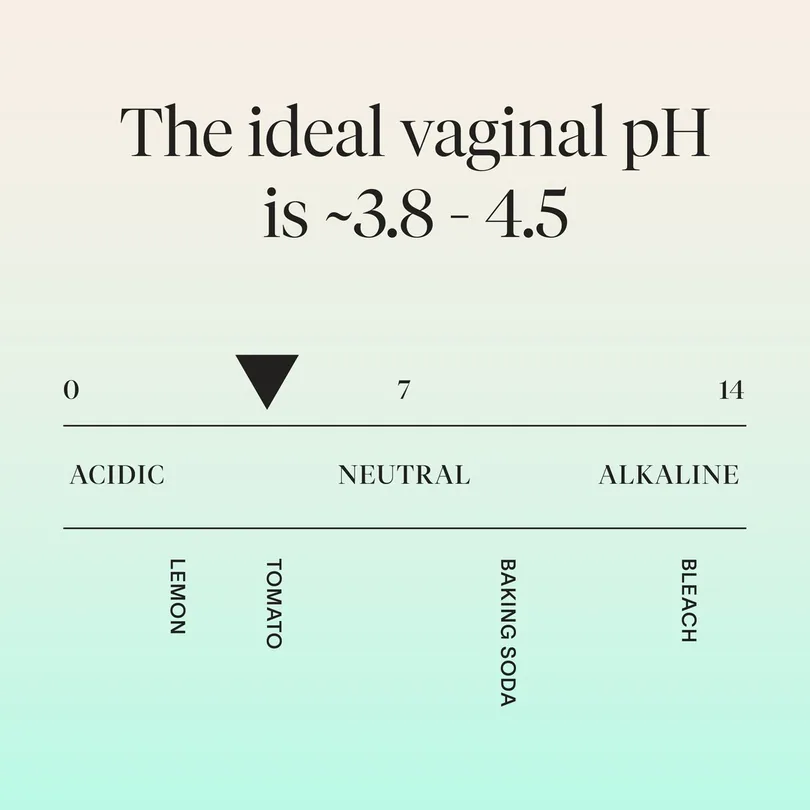
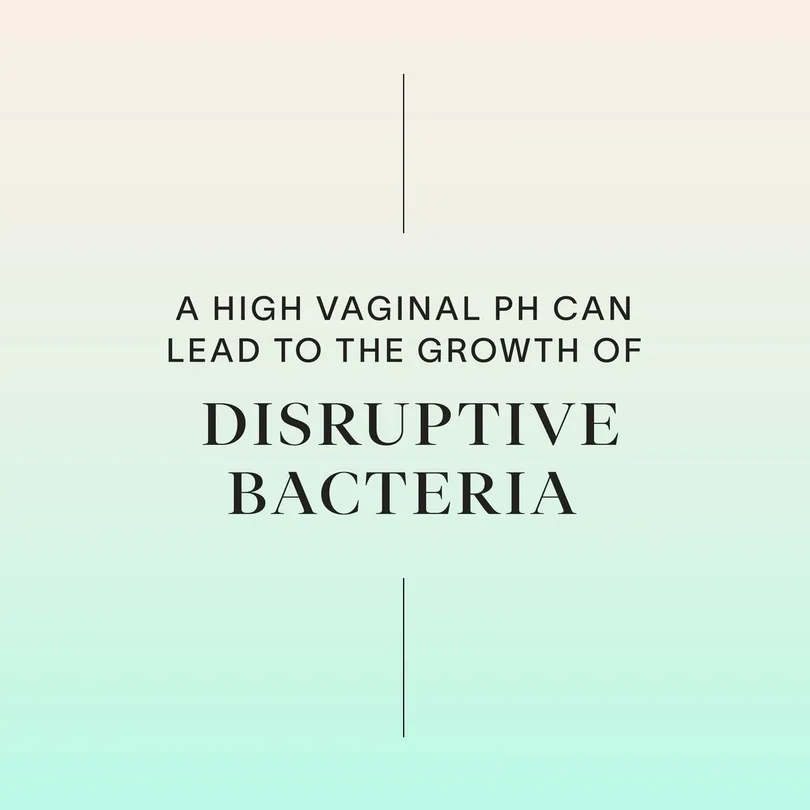
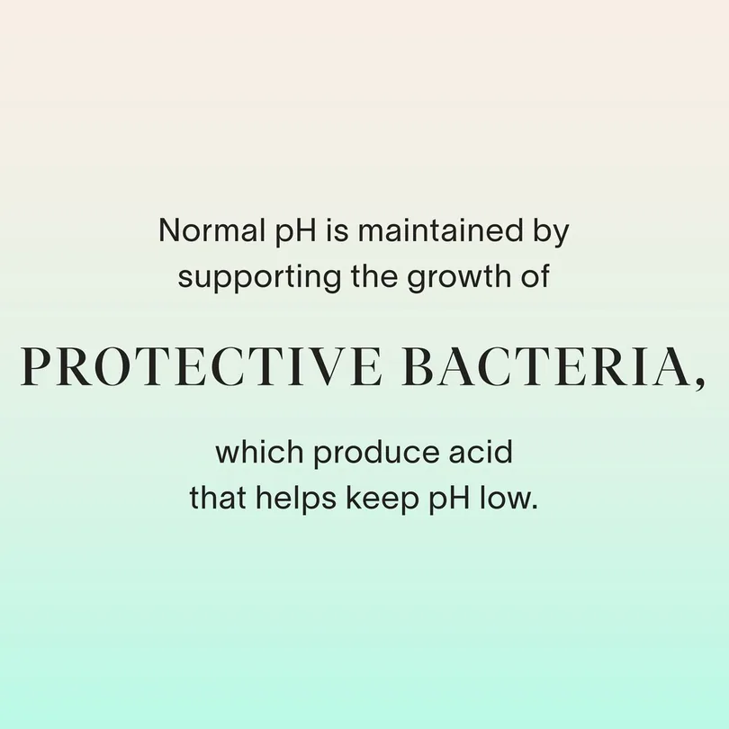
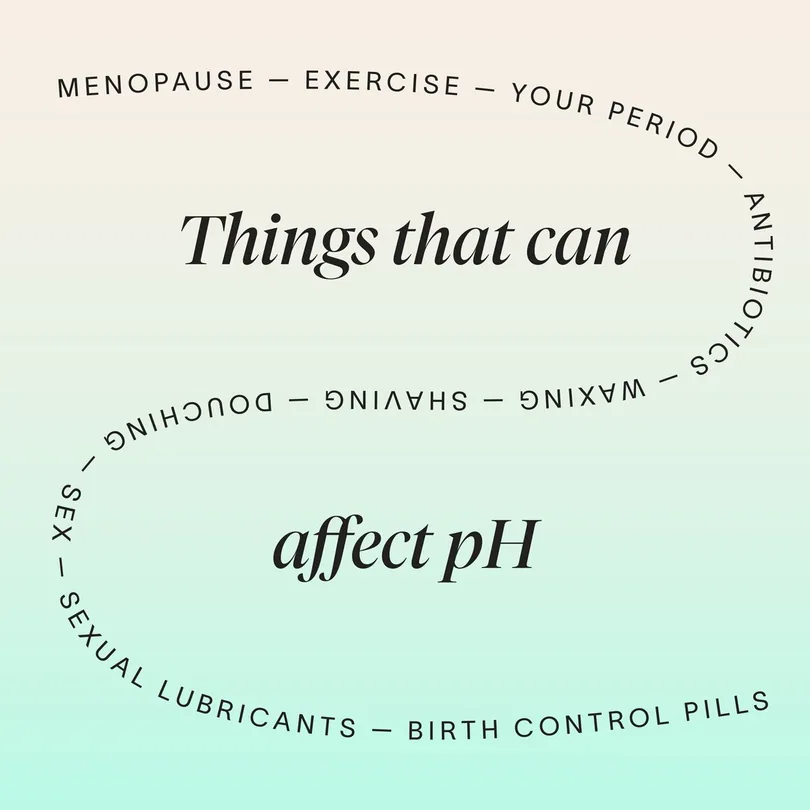
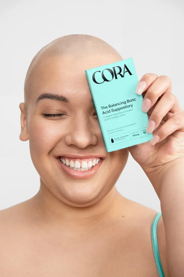
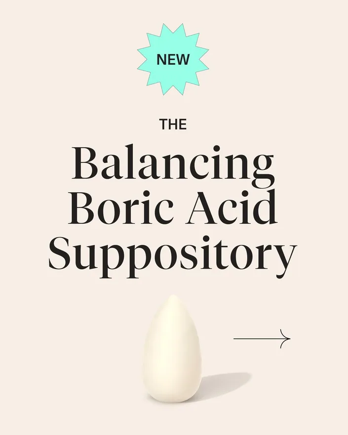
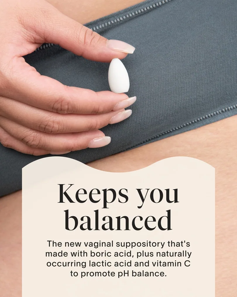
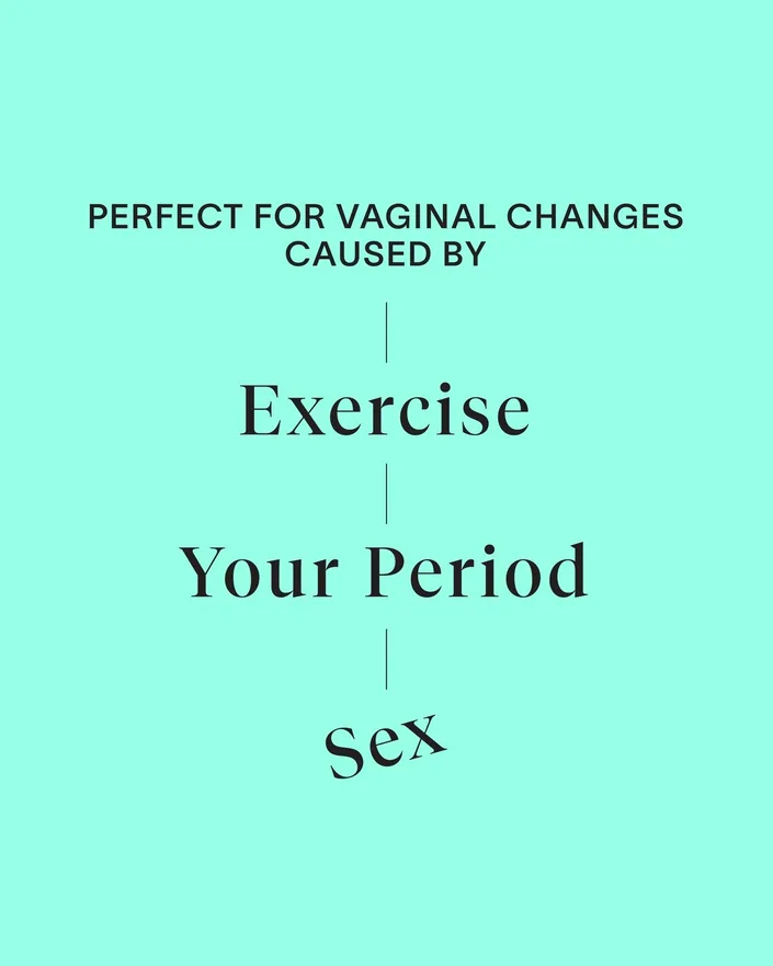
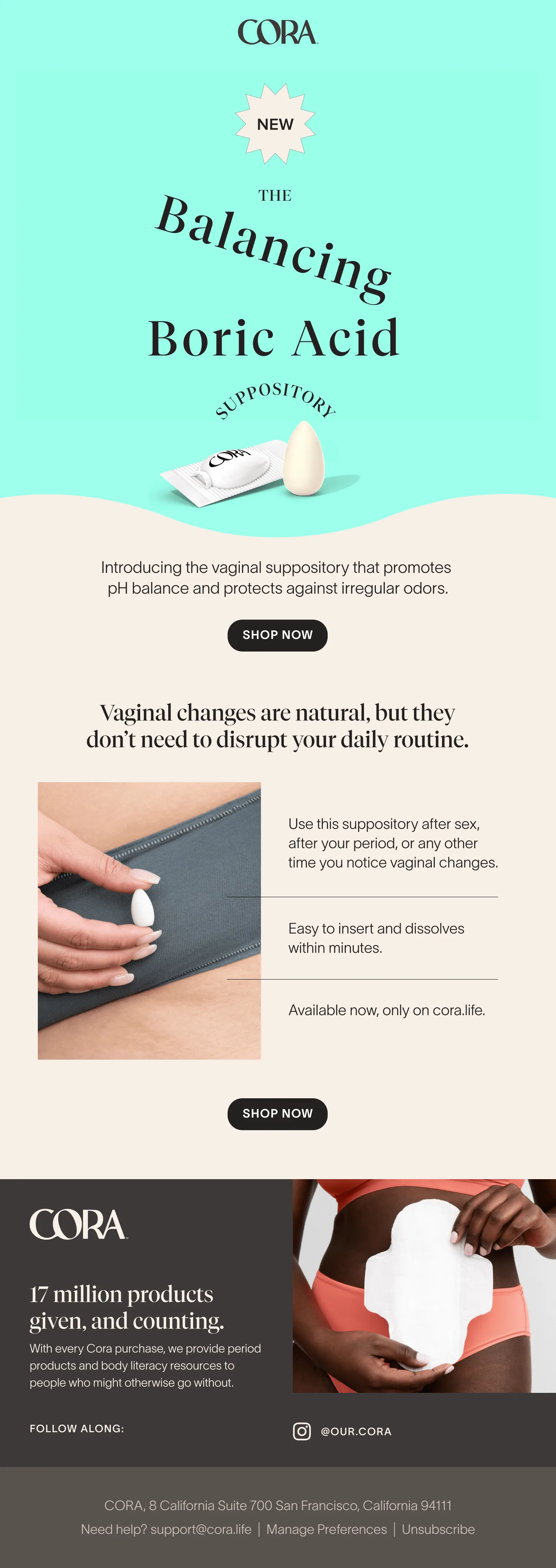
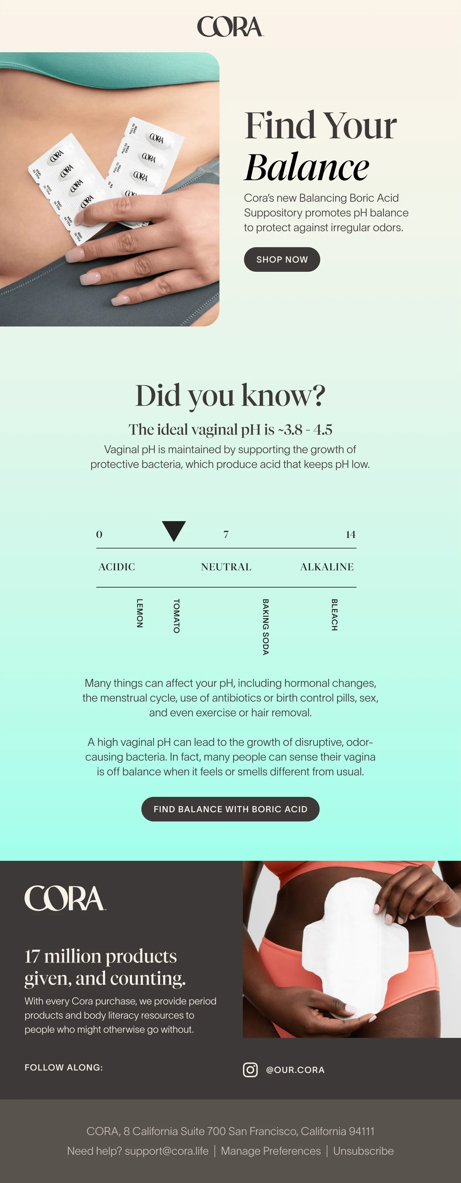
Social, email and Amazon for Cora’s first vaginal health product, explaining pH without the clinical tone.
9:41
Postsour.coraFollow
our.cora
1/5
our.cora Things that can affect your pH, and how to find your balance again. Swipe through.
5 days ago
our.cora
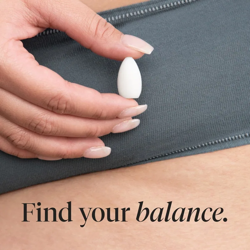
our.cora Keeps you balanced. Our new boric acid suppository, with lactic acid and vitamin C to promote pH balance.
1 week ago
Deep-dive carousel
Launch posts
01 / 03
←
→
05
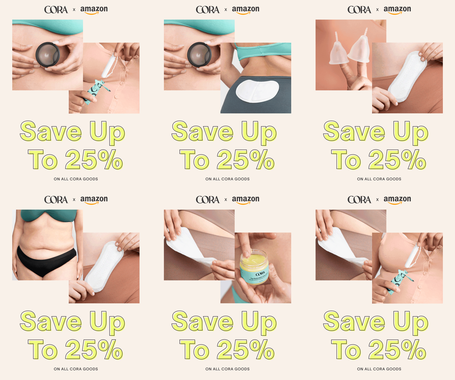
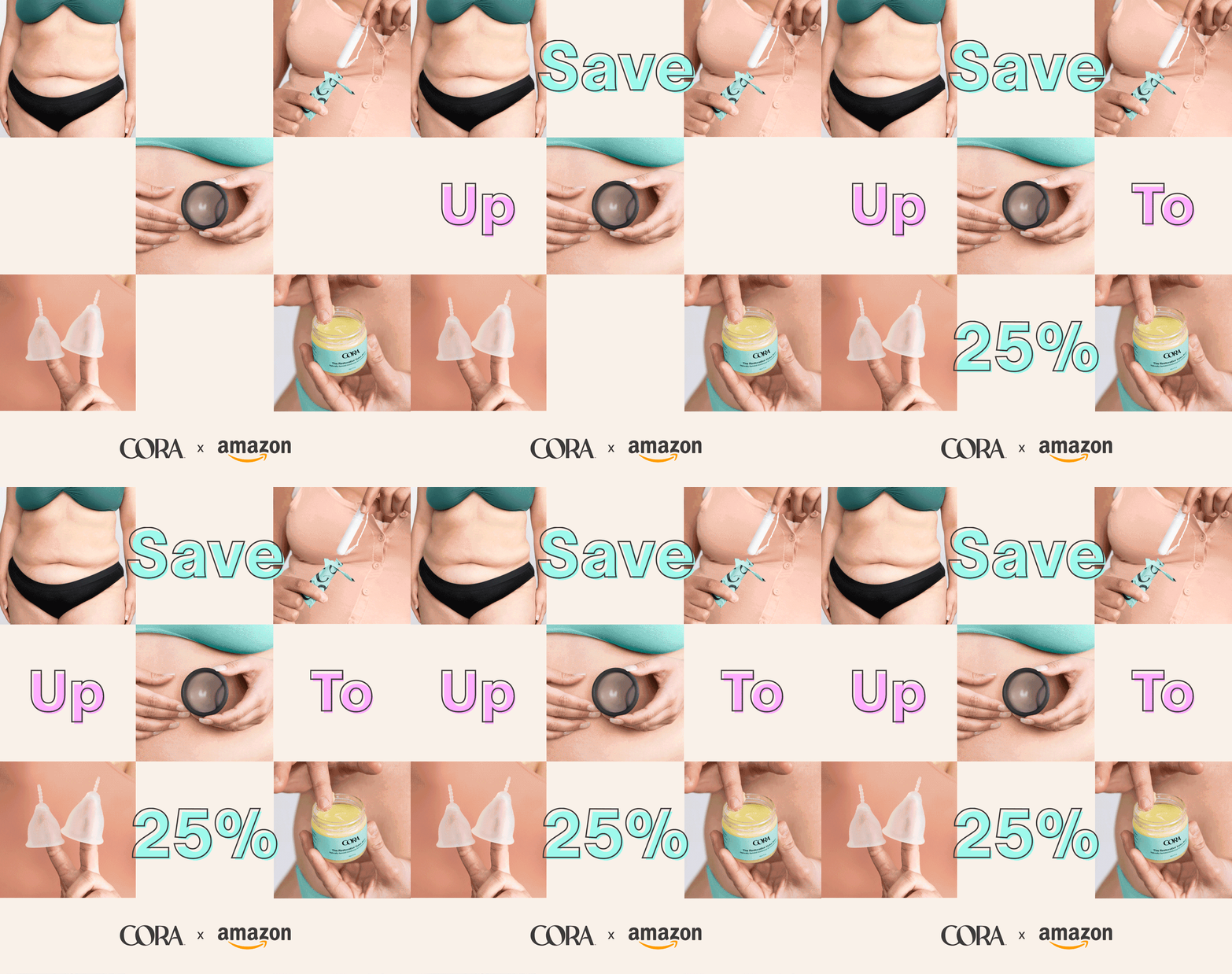
Prime Day, across every channel
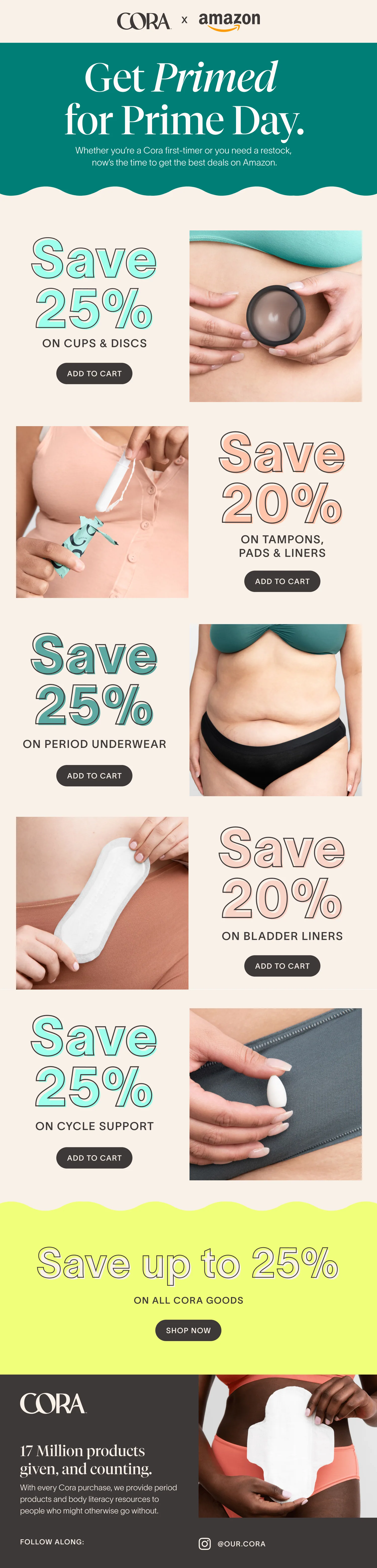
A cross-channel Prime Day campaign: Amazon placements, social, display and email, all speaking with one voice.
/ earlier work
Before the rebrand
Cora launched with a minimalist brand that cut through the pink packaging and busy patterns of the period care aisle at the time. As the product line grew from two SKUs to more than 90, we kept evolving it, launch by launch.
See earlier work +
06
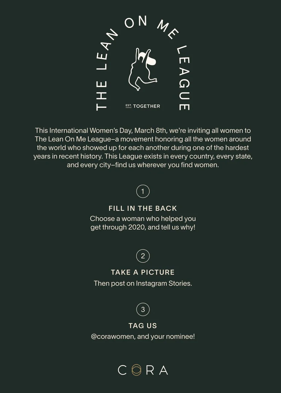
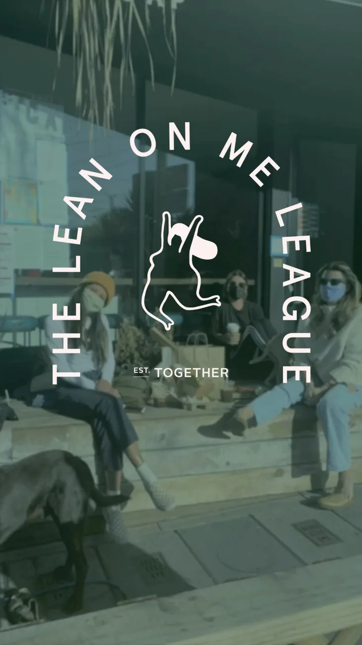
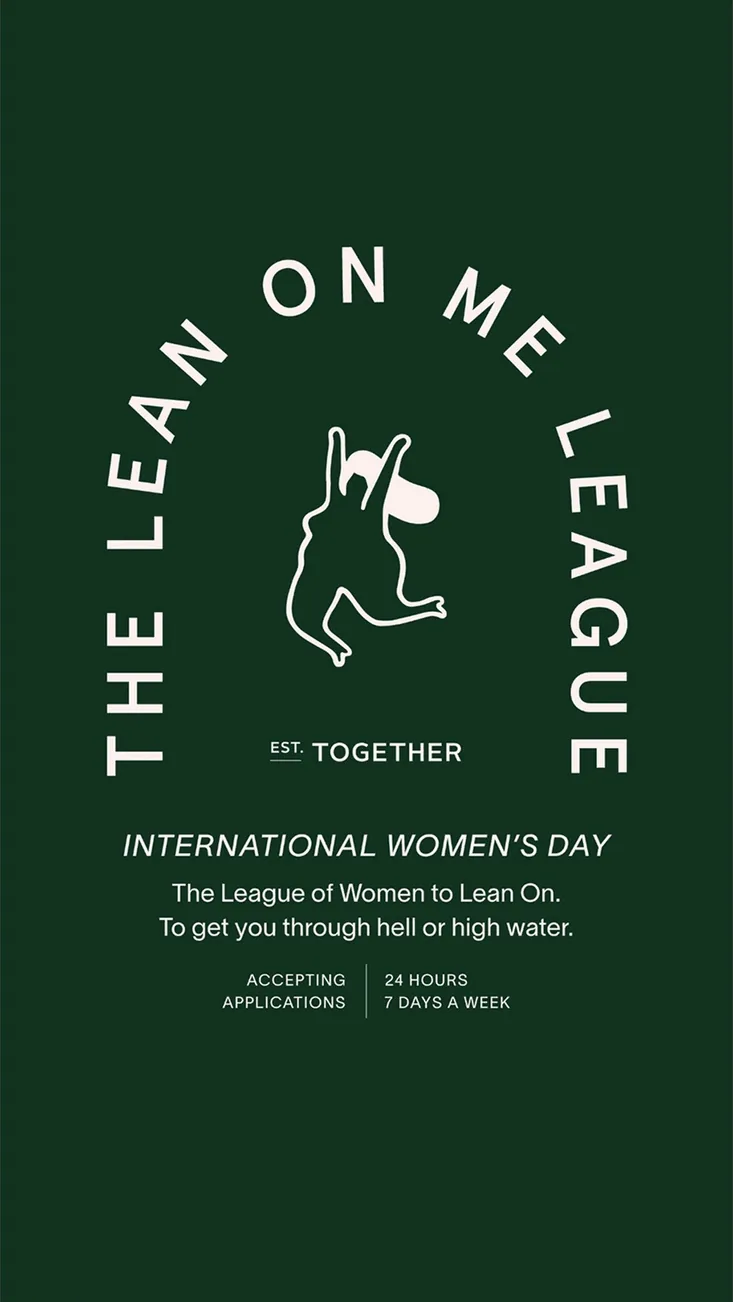
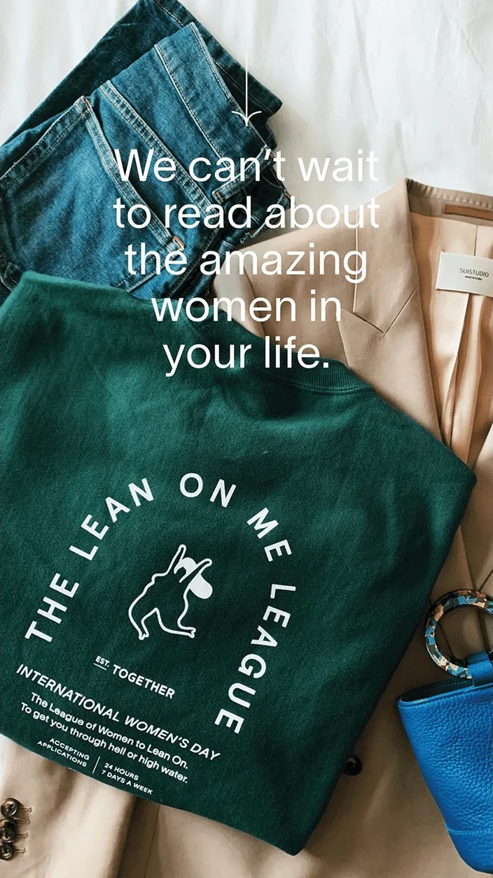
The Lean On Me League
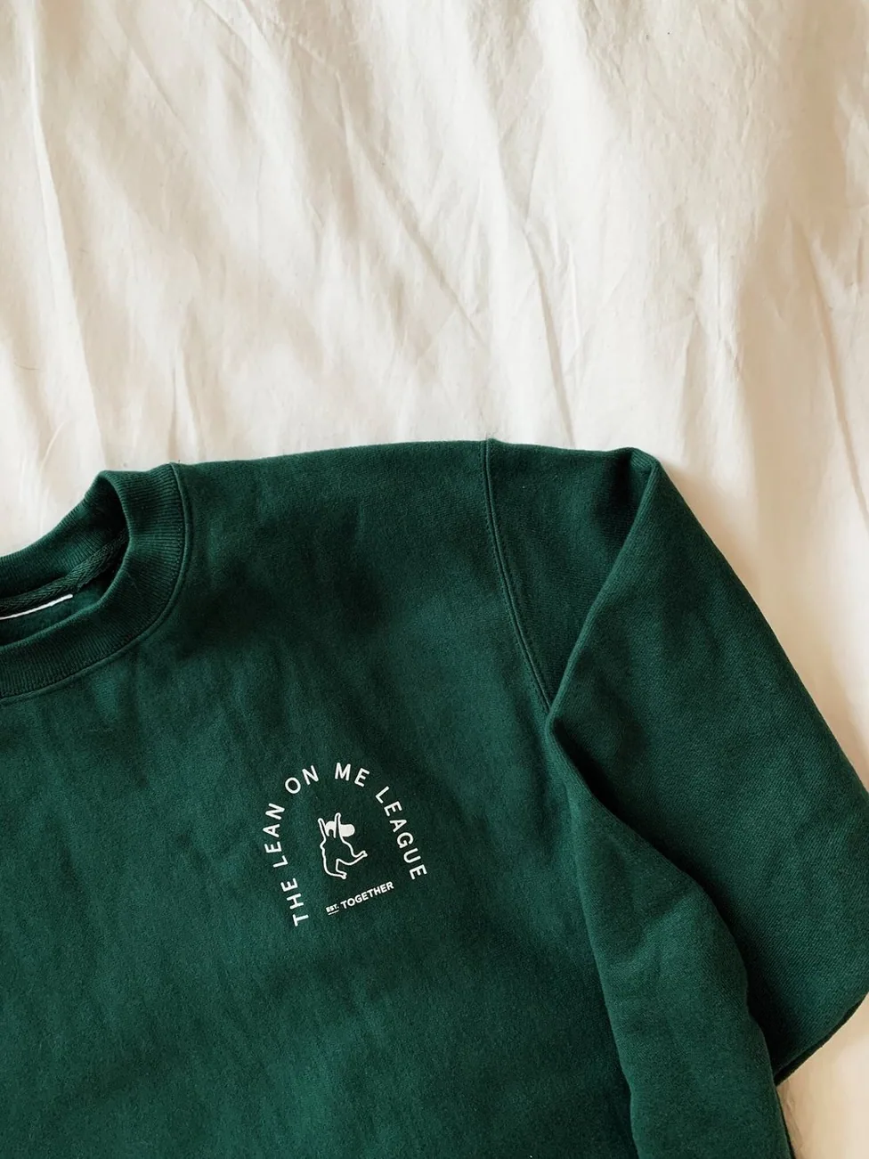
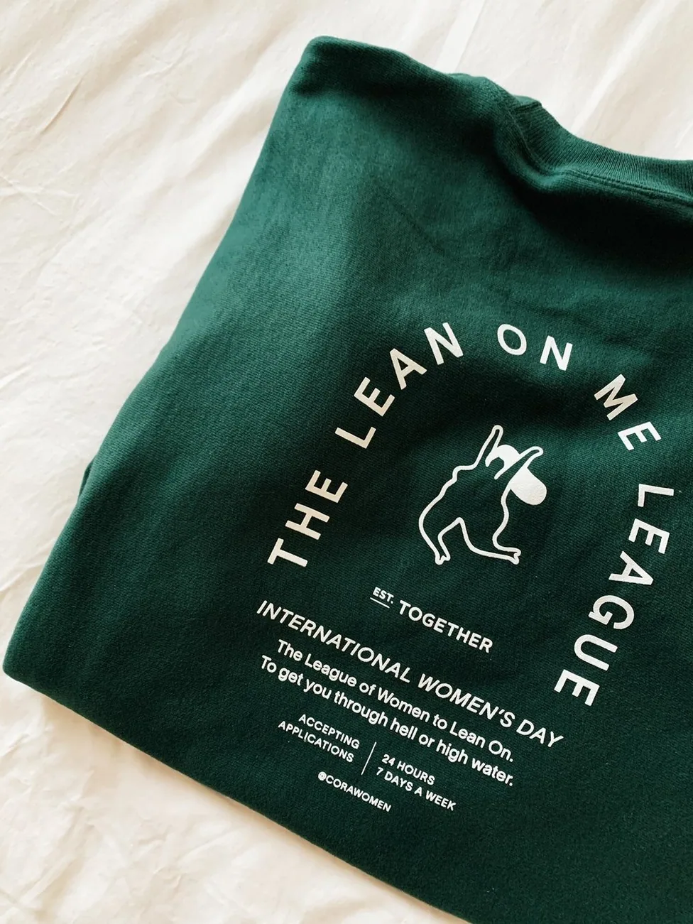
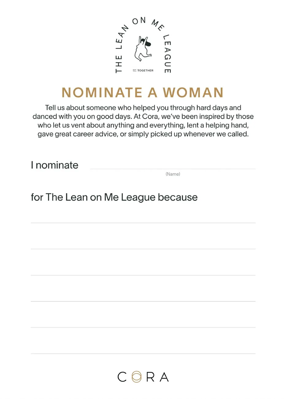
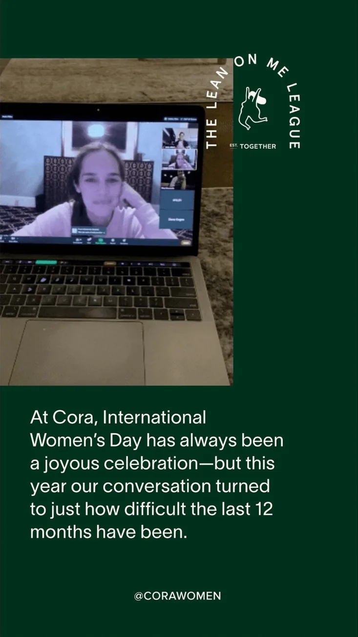
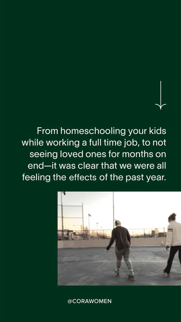
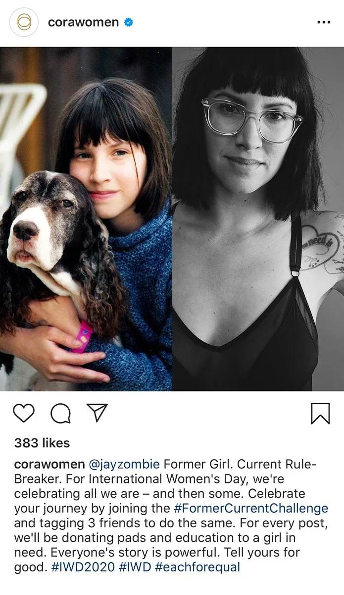
International Women’s Day 2021: after a challenging year, we thanked the women we’d leaned on, with a club sweater, community nominations and giveaways for five friendships.
01 / 09
←
→
07
Packaging worth keeping
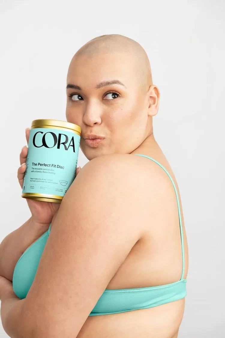
For the reusable collection, a gold tin as reusable as what’s inside, standing out against a dated, flowery aisle. And a size guide that takes the guesswork out of buying a first cup.
08
Email redesign and welcome series
A refreshed email system and welcome series for the original brand.
01 / 07
←
→
09
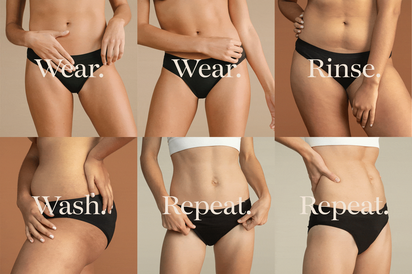
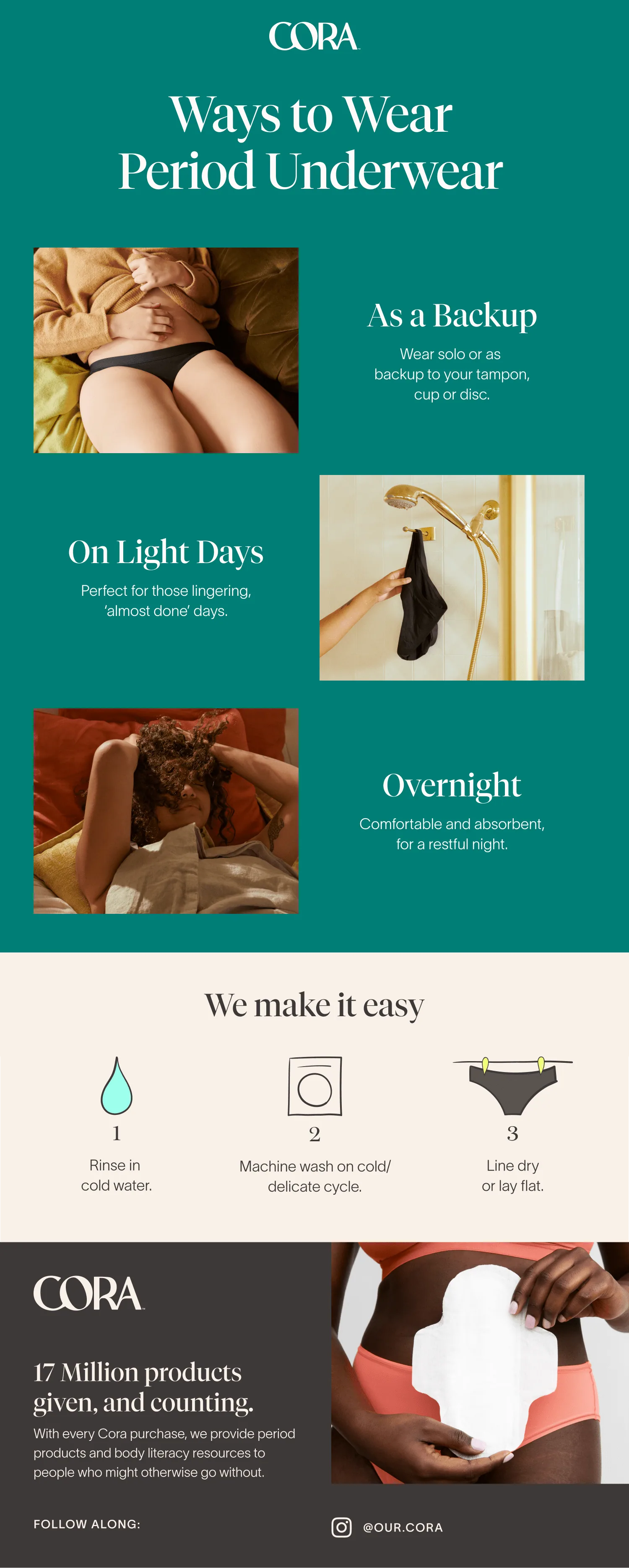
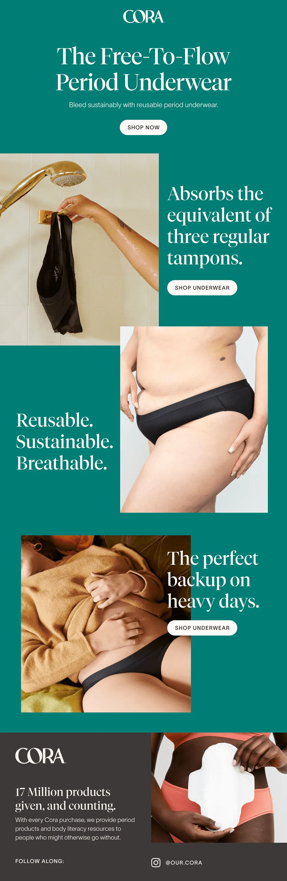
Period underwear launch
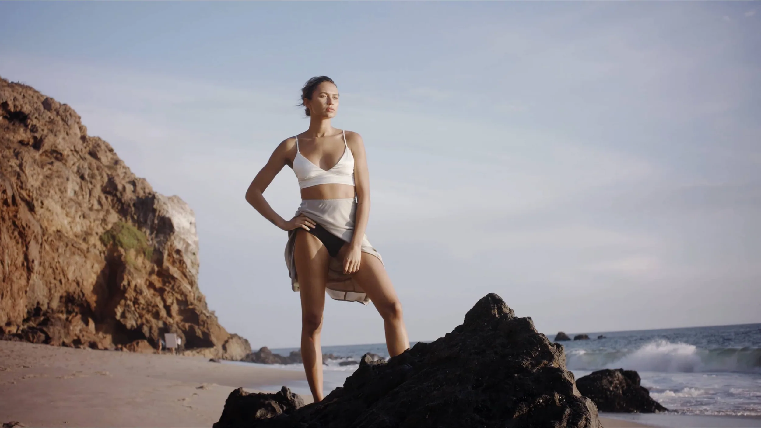
The launch campaign for Cora’s period underwear: hero photography, social and email.
10
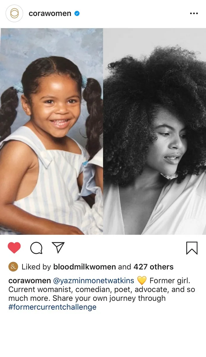
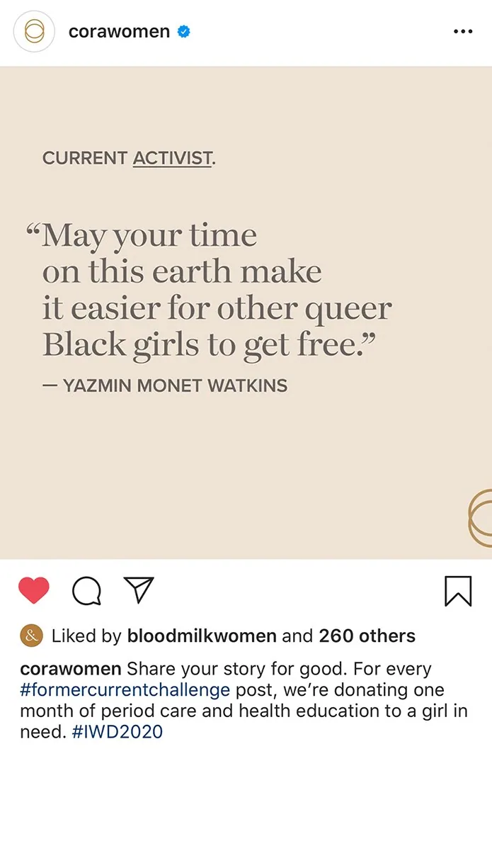
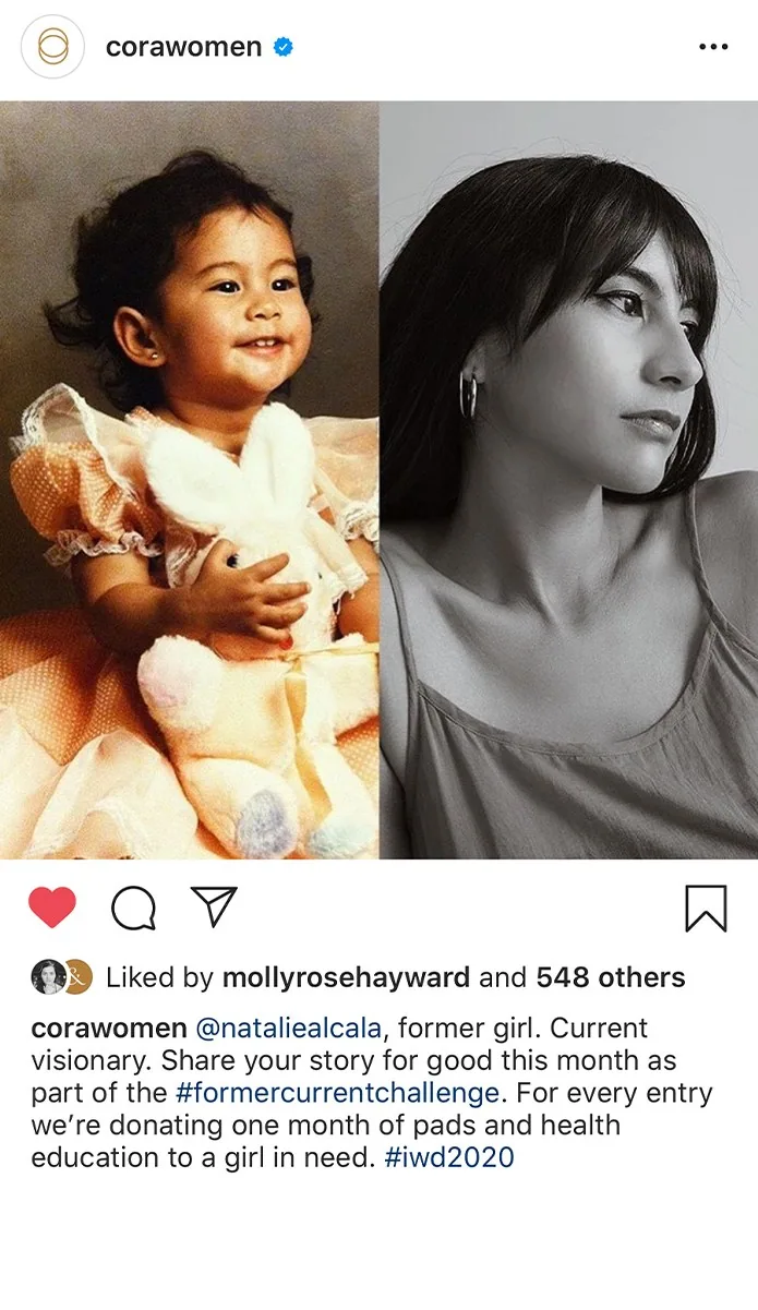
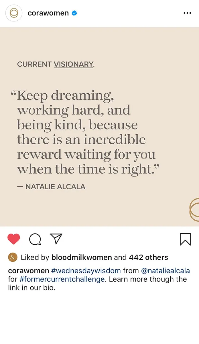
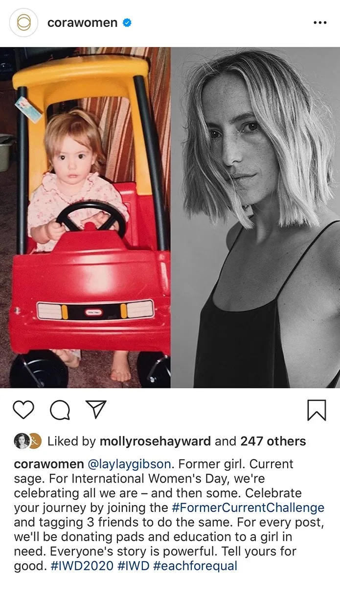
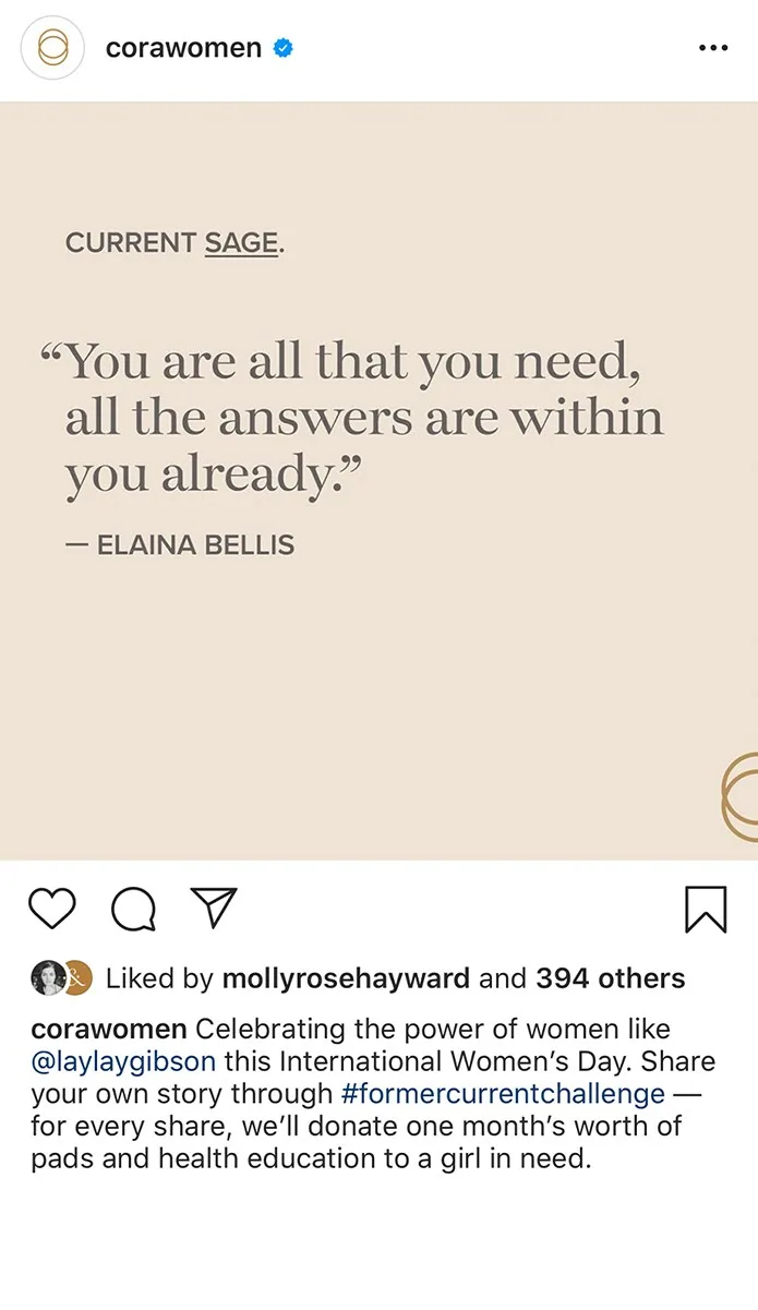
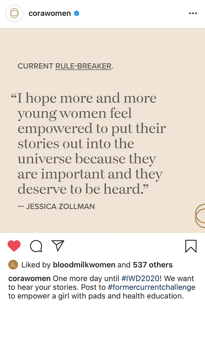
International Women’s Day
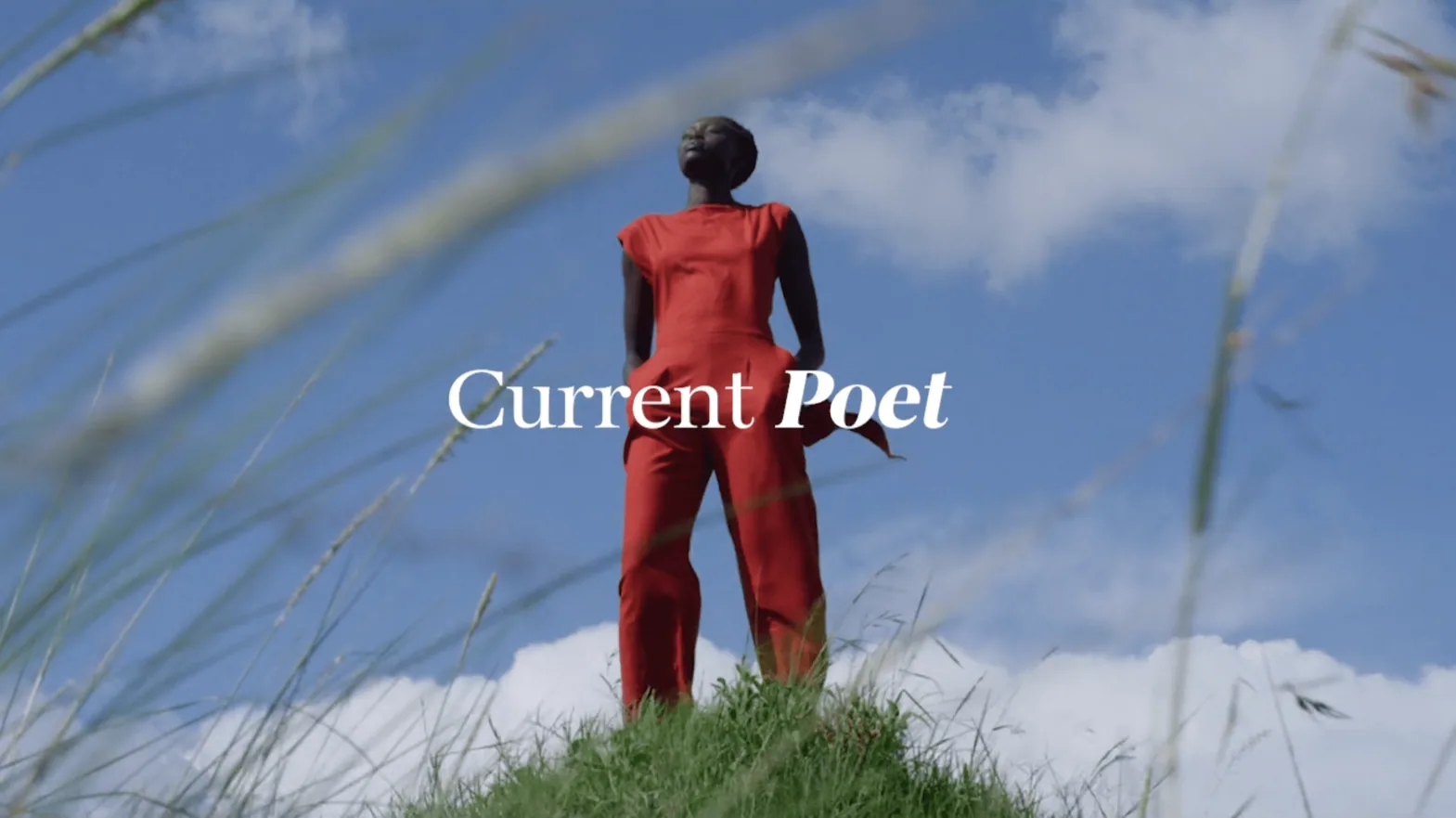
A campaign celebrating the poets, activists, sages and healers of the Cora community.
01 / 08
←
→
/ the partnership
2017–2022, as an early employee on the small team that led packaging design and launch campaigns, conceptualizing several brand campaigns a year while the product line grew from two SKUs to more than 90.
/ the outcome
Cora became a category leader with a brand people recognized on shelf and online. The rebrand was covered by AIGA Eye on Design and Design Week.
50x
revenue growth over four years
90+
SKUs designed and launched, up from 2
13
retailers nationwide, up from DTC and Target
“
Elisa combines strategic thinking, creative talent, and high-quality execution in every project.
Morgan Sterns · Creative Director, Cora
/ credits
Art direction and design, rebrand
Elisa Massenzio, Andrea McCulloch, Morgan Sterns
Art direction and design, original brand
Elisa Massenzio, Brian Powers, Ashley Peak, Ellie Chang

 our.cora